You shape customer perceptions the moment they see your product, and packaging is your first chance to communicate quality. Thoughtful materials, refined typography, and deliberate color choices signal premium value. Every detail, from texture to finish, influences how your brand is perceived. Design with intention, and your packaging will reflect the excellence inside.
Key Takeaways:
- High-quality materials like textured paper, rigid boxes, or metallic finishes signal value and make a product feel more luxurious from the first touch.
- Minimalist design with clean lines, ample white space, and refined typography helps communicate sophistication and exclusivity.
- Color psychology plays a strong role-deep blacks, rich golds, and muted neutrals are often associated with premium brands and influence consumer perception.
- Unique structural design, such as custom box shapes or innovative opening mechanisms, creates a memorable unboxing experience that reinforces premium status.
- Consistency in branding elements-logo placement, font choice, and color palette-across all packaging builds recognition and trust over time.
The Psychology of Haptic Luxury
A well-designed premium product doesn’t just look expensive-it feels like one. Your customers form judgments the moment their fingers touch the packaging. The right tactile experience signals quality, care, and exclusivity, shaping perception before the product is even seen.
Texture as a Silent Salesman
Across high-end markets, texture works quietly but powerfully. A soft-touch matte finish, embossed logo, or linen-like wrap invites touch and triggers emotional responses. You’re not just delivering a product-you’re offering a sensory moment that reinforces value with every finger glide.
Weight and the Perception of Worth
Luxury packaging often carries heft, and you instinctively notice the difference. A heavier box suggests substance, durability, and importance. That slight resistance when lifting it tells your brain: this is worth more.
Indeed, studies show people associate weight with quality, even when the product inside is identical. A heavier package makes your offering feel more substantial and thoughtfully made. You capitalize on this bias by using denser materials, rigid structures, or layered inserts that add mass without waste-making value tangible before a single feature is read.
Minimalism as the Ultimate Sophistication
Some premium brands succeed not by adding more, but by revealing less. Minimalist packaging draws attention through restraint, using clean lines, limited color palettes, and intentional details. You communicate confidence in your product by removing distractions. Simplicity becomes a statement, signaling quality and clarity that resonates with discerning customers.
Stripping Away Visual Clutter
About the most powerful move you can make: remove everything that doesn’t serve a purpose. Visual clutter distracts from your brand’s message and weakens perceived value. When you eliminate excessive text, graphics, and competing elements, you let your product speak for itself. Clarity builds trust.
The Power of Negative Space
Minimalism relies on negative space to create breathing room around your brand elements. You guide the eye to what matters-your logo, product name, or key visual. This intentional emptiness doesn’t feel empty at all; it feels deliberate, calm, and refined. Space becomes part of the design language.
Sophistication often lies in what you choose not to show. Negative space gives your packaging a sense of balance and order, making it easier for customers to focus on your brand’s essence. You create a moment of pause in a crowded market, inviting closer inspection. That silence speaks volumes about quality.
Typography That Commands Respect
To position your product as premium, choose typefaces that reflect sophistication and clarity. The psychology of packaging design that drives repeat sales reveals how deliberate font choices shape consumer perception. Your typography isn’t just text-it’s a silent ambassador of brand value.
Serif Fonts and Heritage
After establishing your brand’s premium intent, serif fonts communicate tradition and credibility. Their structured strokes echo craftsmanship and time-tested quality, often associated with luxury goods and heritage brands. You signal refinement simply by choosing a typeface that feels earned, not rushed.
Letterspacing for Elegance
Behind every refined package lies subtle attention to detail, and letterspacing is no exception. Generous spacing between characters slows the eye, inviting closer inspection and conveying exclusivity. You create breathing room that makes your brand feel deliberate and poised.
Further control over letterspacing allows you to fine-tune readability and tone. Too tight, and the text feels cluttered; too wide, and it loses cohesion. You strike balance by adjusting spacing to match your brand’s rhythm, ensuring each word feels intentional and polished without drawing attention to the technique itself.
Color Palettes of the Elite
Once again, the world’s most premium brands rely on color to signal exclusivity. Your packaging’s palette speaks before a word is read-choose wisely. Deep tones, restrained contrasts, and refined finishes set the stage for perceived luxury, shaping customer expectations from the first glance.
Deep Hues and Metallic Accents
At the core of elite packaging are deep hues like navy, charcoal, and burgundy, often paired with metallic foils in gold, silver, or copper. These combinations convey sophistication and craftsmanship. Your use of subtle shine against rich backgrounds signals quality without needing to say a word.
Consistency Across the Brand Portfolio
Above all, premium perception grows from uniformity. When every product in your line uses the same color language, customers instantly recognize your brand as deliberate and trustworthy. Consistency builds confidence, making each item feel like part of a curated collection.
This means applying your signature colors and finishes across all touchpoints-primary boxes, labels, inserts, and even digital mockups. When someone sees your packaging in a drawer or on a shelf, it should register immediately as yours. That recognition doesn’t come from novelty-it comes from repetition done with precision.
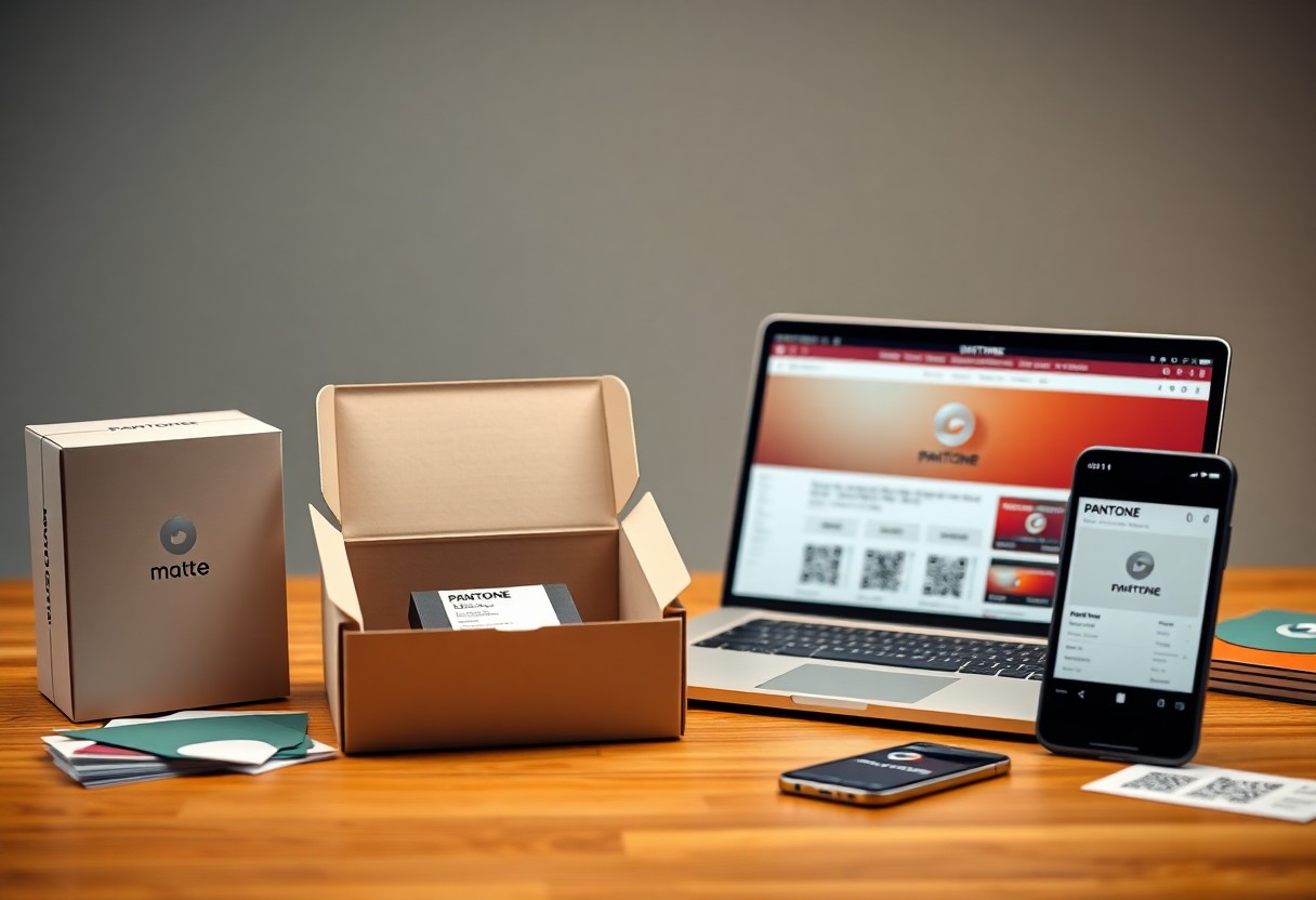
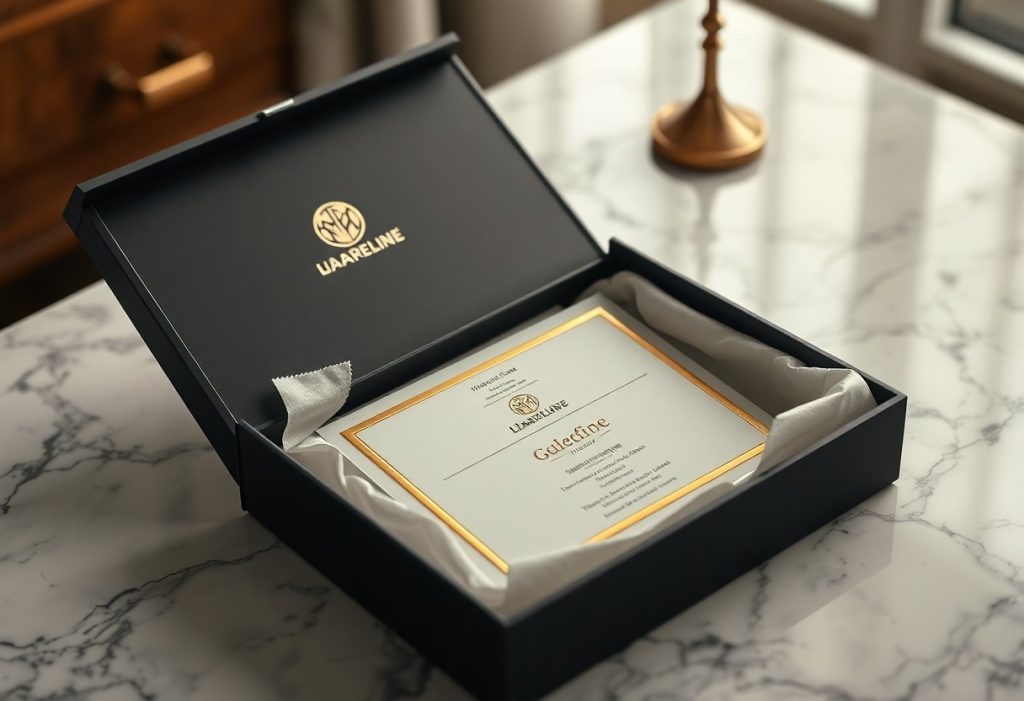
The Unboxing Ritual
Many premium brands understand that unboxing is more than opening a package-it’s a moment of connection. You shape expectations the second your customer lifts the lid. A deliberate sequence of reveals builds anticipation, turning a simple act into a memorable experience that reinforces the value of what’s inside.
Layering the Consumer Experience
Layering your packaging creates a journey, not just containment. You guide attention step by step-outer sleeve, tissue wrap, custom insert-each element revealing a little more. This progression slows the moment, making your customer feel the care behind every detail and deepening their emotional bond with your product.
Sensory Details Beyond the Visual
By incorporating texture, sound, and scent, you engage senses beyond sight. The soft-touch coating, the crisp snap of a sealed flap, a subtle fragrance on the insert-these elements work together to create a richer impression. You’re not just selling a product; you’re delivering a feeling.
Further sensory engagement strengthens memory and perception. You make your product unforgettable when the box emits a faint, signature scent upon opening or when the inner lining offers a contrast in texture. These subtle cues register unconsciously, shaping how your brand is perceived long after the unboxing ends.
Materials and Excellence
Your choice of packaging materials directly signals quality to the customer. Premium perception starts with substance-how the package feels, weighs, and responds to touch. Selecting refined, durable materials sets a tone of care and intention, positioning your product as one worth paying more for.
High-Grade Sustainable Substrates
Above all, choose substrates that reflect both luxury and responsibility. Recycled paper with a refined finish, biodegradable films, or responsibly sourced wood-based materials convey sophistication while aligning with eco-conscious values. Quality sustainability isn’t a compromise-it’s a hallmark of modern premium design.
Finishing Techniques for Distinction
With techniques like soft-touch coatings, spot UV, foil stamping, or embossing, your packaging gains tactile and visual depth. These details catch light, invite touch, and differentiate your product on crowded shelves. Precision in finish signals precision in product.
Indeed, the best finishing techniques are subtle but unmistakable. A matte laminate with a raised logo, or a metallic accent applied with exact alignment, tells the customer that no detail was overlooked. These choices don’t shout luxury-they whisper it, and that whisper is far more persuasive.
To wrap up
Summing up, you shape how customers perceive your product’s value through deliberate packaging design. Clean lines, premium materials, and thoughtful details signal quality before the product is even used. You control the first impression-make it reflect the excellence inside the box.
FAQ
Q: How does packaging material influence the perception of a product as premium?
A: The choice of packaging material directly signals quality to consumers. Materials like thick matte cardboard, soft-touch coatings, glass, or metal feel more substantial in hand than flimsy plastics or standard paperboard. A heavier box or a bottle with a smooth finish suggests care in production and justifies a higher price point. Textured finishes, embossing, or foil stamping add visual and tactile cues that people associate with luxury. When customers see and touch packaging that feels expensive, they assume the product inside meets the same standard.
Q: Can color and typography in packaging design make a product seem more premium?
A: Yes, color and typography play a major role in shaping premium perception. Minimalist color palettes-such as black, white, deep navy, or metallic tones-convey sophistication and exclusivity. Overly bright or cluttered color schemes often suggest mass-market appeal. Typography matters just as much: clean, custom, or serif fonts with generous spacing look refined, while generic or playful fonts can undermine a high-end image. The combination of restrained color and elegant type creates a sense of quiet confidence that aligns with premium branding.
Q: What role does unboxing experience play in positioning a product as premium?
A: The unboxing experience turns a simple purchase into a moment of anticipation and delight. Premium brands often design layered reveals-such as a magnetic closure box, tissue paper wrapping, or a personalized note-to slow down the moment of first contact. This deliberate pacing makes the customer feel valued and heightens the sense of occasion. Thoughtful details like custom inserts, scent strips, or reusable packaging extend the experience beyond the product itself. When people share these moments on social media, the brand gains visibility and reinforces its upscale identity.