
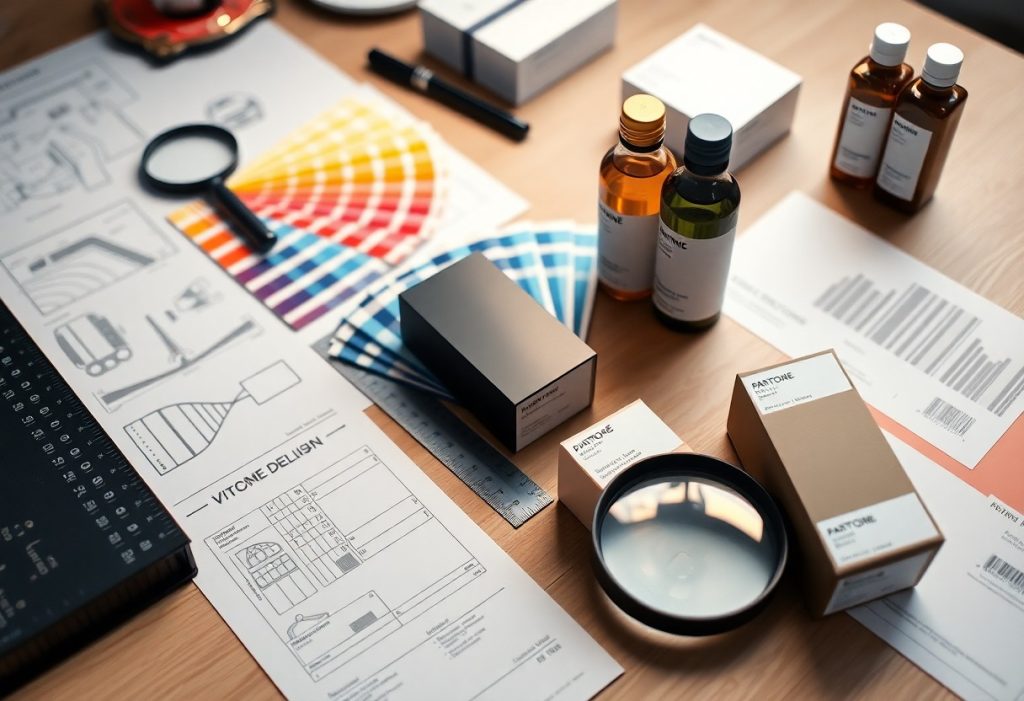
Packaging shapes how you perceive a product before you even use it. Every color, font, and shape is chosen to influence your emotions and decisions. You respond to visual cues instantly, often without realizing it. Smart packaging design uses psychological principles to guide your choices, build trust, and create lasting impressions at the shelf.

Key Takeaways:
- Color choices in packaging directly influence consumer emotions and purchasing decisions, with specific hues triggering predictable psychological responses-like red creating a sense of urgency or blue conveying trust.
- Shape and typography affect how a product is perceived; rounded edges often feel friendly and safe, while sharp angles may suggest precision or luxury, and font styles can silently communicate whether a brand is playful, elegant, or reliable.
- Consumers respond strongly to packaging that tells a story or creates a sensory experience, using texture, imagery, or layout to form an immediate emotional connection before the product is even used.
The Chromatic Trigger
Color shapes how you perceive a product before you even touch it. Your brain processes visual cues in seconds, and packaging hue often determines your first impression. Brands use this reflex to guide your choices, aligning color with desired emotions and expectations.
Emotional Responses to Pigment
You react to red with energy and urgency, while blue calms and builds trust. Each shade triggers a distinct emotional current beneath conscious thought. These automatic responses influence whether you feel excited, relaxed, or skeptical about what’s inside the package.
Cultural Context of Color
What feels lucky or sacred in one region may carry entirely different weight in another. Your interpretation of color is shaped by the traditions and symbols you grew up with, making global packaging a careful balancing act of local meaning.
White symbolizes purity in some Western markets, often used in minimalist, premium designs. In parts of Asia, it’s tied to mourning and loss. When you sell across borders, ignoring these associations risks alienating the very customers you aim to attract. A red package may signal luxury in one country and danger in another-your design must adapt accordingly.
The Geometry of Desire
Shape speaks before words, silently guiding your hand toward one product over another. Curved edges feel friendly, while sharp corners command attention-each form taps into deep psychological cues. Learn more about The Psychology of Great Packaging Design to see how form shapes choice.
Curvature and Approachability
Soft, rounded shapes invite touch by signaling safety and warmth. You’re more likely to perceive a product with curved packaging as gentle or nurturing, making it ideal for personal care or family-focused brands. These forms mimic organic shapes found in nature, triggering subconscious feelings of comfort and trust without you even realizing it.
Angularity and Authority
Sharp lines and rigid edges project strength and precision. When you see angular packaging, your brain registers control and reliability-traits valued in tech, luxury, or performance-driven products. These shapes don’t ask for affection; they demand respect, positioning the brand as confident and uncompromising in its quality and purpose.
Angular designs activate a cognitive response linked to stability and structure. Your mind associates straight lines and defined corners with man-made precision, often equating them with innovation and high performance. This makes sharp geometries especially effective for products where technical superiority matters-think electronics, premium spirits, or engineering-focused tools. The lack of softness isn’t a flaw; it’s a deliberate signal of power and intent.
The Haptic Experience
How a product feels in your hands shapes your judgment before you even use it. Touch activates emotional and cognitive responses that influence perception of quality, value, and trust. Your skin senses texture, temperature, and weight, translating physical cues into subconscious evaluations that often decide purchase outcomes.
Texture as a Quality Proxy
Texture signals craftsmanship and attention to detail. A slightly raised logo or soft-touch coating tells you the brand invested in its presentation. You equate fine surface finishes with superior performance, even if the product inside remains unchanged. Smoothness, grit, or pattern all feed your instinctive quality assessment.
Weight and Perceived Value
Weight often tricks your mind into seeing value. A heavier package feels more substantial, suggesting premium contents. You assume density equals durability or richness, even when weight comes from the container itself. That slight heft in your palm can justify a higher price in your mind.
Brands intentionally use material density to shape your expectations. A thick glass bottle or a rigid cardboard sleeve adds mass that you interpret as integrity. This sensory cue bypasses logic-your brain links weight with worth, making the product feel more authentic, potent, or luxurious without a word being read.
The Unboxing Narrative
Every package tells a story the moment you hold it. You’re not just opening a product-you’re stepping into a sequence designed to unfold with purpose. The way layers separate, how the contents appear, and even the sound it makes all shape your experience, turning a simple act into a memorable moment.
Anticipatory Satisfaction
You feel a quiet thrill before you even see the product. That tension between wanting to rush and wanting to savor builds emotional investment. Designers use this pause to amplify your connection, making the reveal feel earned and deeply personal.
The Mechanics of Revelation
How a product emerges from its packaging influences your perception of value. A drawer that glides open, a lid that lifts to reveal symmetry-these small actions signal care and intention. Each motion becomes part of the experience, shaping how you judge quality.
What makes the mechanics so effective is their precision. The resistance of a tab, the alignment of compartments, even the order in which items are revealed-all are calibrated to guide your attention. These details don’t just protect the product; they choreograph your interaction, transforming function into feeling. You don’t just receive an object-you witness its arrival.
Cognitive Shortcuts
Your mind processes packaging in seconds, relying on mental shortcuts to make quick decisions. These cognitive shortcuts help you assess value, quality, and relevance without conscious effort. Designers use this instinctive thinking to guide your choices, embedding cues that align with how you naturally interpret visual information.
Heuristics of Visual Clarity
Clarity shapes your first impression. When information is easy to read and well-organized, your brain sees the product as more trustworthy. You’re more likely to choose a package where benefits, ingredients, or usage are instantly understandable, because it reduces mental effort and speeds up decision-making.
Recognition Speed
Speed determines whether you notice a product at all. Familiar shapes, colors, and fonts trigger instant recall, helping you identify brands even in crowded spaces. Your brain rewards simplicity with attention, making fast recognition a silent driver of purchase behavior.
Recognition speed isn’t just about being seen-it’s about being understood in under a second. When visual elements like logo placement, color contrast, and typography follow consistent patterns, your brain retrieves stored associations effortlessly. This near-instant connection gives certain packages a competitive edge, not because they’re louder, but because they’re faster to process. You’re more likely to reach for what your mind already knows, even if you can’t explain why.
Final Words
So your perception of a product begins long before you use it-often the moment you see the package. Colors, shapes, and typography silently influence your emotions and decisions. You respond to design cues that tap into subconscious preferences, making packaging a powerful tool in shaping behavior and driving choice.
FAQ
Q: How does color influence consumer behavior in packaging design?
A: Color triggers emotional and psychological responses that directly affect purchasing decisions. Warm colors like red and orange can create a sense of urgency, which is why they’re often used in clearance sales or fast-moving consumer goods. Blue tends to convey trust and reliability, making it common in healthcare or financial product packaging. Consumers make split-second judgments about products, and color accounts for up to 60% of that initial assessment. The right color palette aligns with the brand’s personality and the expectations of its target audience, shaping perception before a single word is read.
Q: Why do shapes and fonts on packaging impact how consumers perceive a product?
A: The shape of a package and the style of typography send subtle messages about a product’s quality, origin, and intended use. Rounded edges and soft curves are often associated with friendliness and safety, making them popular for family-oriented or organic products. Angular shapes suggest precision and modernity, frequently used in tech or luxury items. Fonts work the same way-script typefaces imply elegance or tradition, while bold sans-serif fonts feel contemporary and direct. These design choices tap into learned associations, guiding consumers to form quick, often unconscious opinions about what’s inside the package.
Q: Can packaging design affect how a product tastes or feels?
A: Yes, packaging can alter sensory perception through a phenomenon known as cross-modal correspondence. Studies show that people rate chocolate as richer when wrapped in gold, or perceive drinks as more carbonated when the packaging uses sharp, dynamic lines. The weight, texture, and even sound of a package-like the snap of a lid or the rustle of a bag-contribute to expectations about quality and freshness. When packaging feels premium, consumers are more likely to believe the product inside tastes better, even if it’s identical to a plainer version. Design doesn’t just present the product-it becomes part of the experience.