
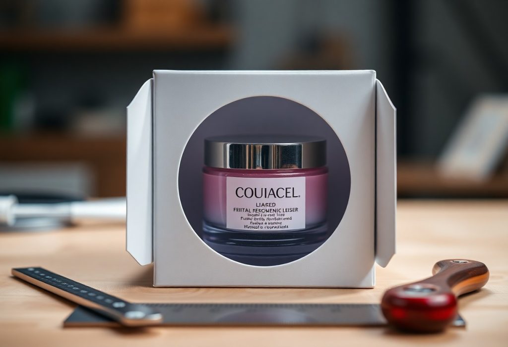
Presentation begins the moment your product comes into view, and die cut packaging ensures that moment lands with precision. You see the clean lines, the custom shape, the way the box frames your item like a display case. This is not just packaging. It’s a silent ambassador for your brand, engineered to capture attention, communicate quality, and guide the customer’s hand and eye exactly where you want them.

Key Takeaways:
- Die cut packaging creates a distinctive silhouette that captures attention on crowded retail shelves, such as a cosmetics brand using a window-cut sleeve to frame its lipstick like a jewel.
- Precision-cut openings guide the customer’s hand and eye to the product itself, reducing visual clutter and eliminating the need for excessive labeling or graphics.
- Custom interior cradles formed through die cutting protect delicate items while reinforcing brand care, as seen with a premium audio company that molds foam inserts to hold earbuds in a floating effect.
The Sharp Edge of First Impressions
The window to the product soul
A precisely die-cut window frames your product like a gallery display, drawing the eye to its form, texture, and quality without obstruction. You’re not hiding behind layers of packaging; you’re inviting inspection, signaling confidence in what’s inside. A skincare brand, for instance, might showcase a cream’s silky texture through a shaped aperture, letting the product speak for itself.
Light catches the exposed surface, enhancing perceived freshness or craftsmanship. This direct visual access reduces guesswork, aligning expectation with reality the moment the item enters view.
Why a clean cut creates value
Sharp, consistent edges signal precision in manufacturing, implying the same care was applied to the product within. A jagged or misaligned cut suggests oversight, while a flawless contour reinforces brand reliability. Consider a premium candle housed in a box with a perfectly aligned oval window-its symmetry subtly communicates attention to detail.
Die cutting allows complex shapes that standard scoring and folding cannot achieve, enabling unique silhouettes that distinguish your package on crowded shelves.
Each cut follows a custom steel rule or laser path, ensuring repeatability across production runs. A mid-sized SaaS firm distributing hardware kits uses angular window cuts that mirror their app’s interface design, creating a tangible link between digital and physical branding. This alignment strengthens recognition and trust without a single word printed.
The Architecture of the Unboxing
Every movement you make when opening a package contributes to a choreographed experience, one where die cut precision guides your hands and eyes in tandem. The way a tab pulls free or a flap lifts to reveal a product is no accident, but a result of deliberate structural planning that turns a simple opening into a moment of anticipation. Learn more about this design philosophy at How Die Cut Packaging is a Better Option? | Journal.
Form following the function of desire
Shape follows emotion just as much as utility when you interact with die cut packaging. A contour that mirrors the product inside doesn’t just protect-it suggests value before the item is even visible. Consider how a cosmetics brand might cradle a lipstick in a crescent cutout, turning the act of retrieval into a gesture of indulgence.
Structural integrity in the hand
Weight, rigidity, and balance signal quality the moment you lift the box. Die cut sections are engineered to maintain strength, even when removing material for visual effect. A mid-sized SaaS firm shipping hardware devices reported fewer returns after switching to reinforced die cut trays that held components securely during transit.
Reinforced creases and scored folds ensure the package retains its shape under pressure, resisting crush damage while still allowing clean, intuitive opening. This balance between fragility and durability is achieved through precise calibration of material thickness and cut placement, ensuring the structure supports both protection and presentation.
Branding Without the Noise
Silence in the silhouette
Shape speaks before words, and a die cut package uses negative space to command attention. You don’t need bold colors or dense text when the outline itself becomes the message. A perfume bottle revealed through a window cut in the form of a crown immediately signals luxury. The absence of material defines the brand’s confidence, letting the product’s form answer the question of identity.
The logo as a physical shape
Your logo doesn’t have to be printed to be seen. When the package is cut into the shape of your emblem, the brand becomes tactile. A cookie company might ship its treats in a box shaped like its mascot’s hat, recognizable even when closed. This integration turns packaging into a three-dimensional signature.
Consider how Apple’s minimalist boxes rely on precision, not graphics, to convey quality. When your logo is the container, recognition happens at a glance, without a single ink stroke. The shape becomes memory, stored not in text but in form. A child might not read the brand name, but they’ll recognize the cereal box shaped like a character’s head. Physicality deepens recall.
Efficiency and the Honest Material
Less waste in the cut
Die cutting shapes packaging with precision, removing only what’s necessary to form the structure. You reduce scrap material significantly compared to traditional cutting methods, especially when working with large production runs. A mid-sized SaaS firm shipping hardware devices saw material usage drop by reconfiguring their layout across sheets. Every millimeter saved adds up in both cost and sustainability.
Cardboard that speaks for itself
High-quality cardboard, cleanly die cut, needs no extra embellishment to convey strength and care. The sharp edge of a well-cut flap or window frame signals attention to detail before the package is even opened. You rely on the integrity of the material itself, not coatings or laminates, to communicate value.
When the cardboard grain runs parallel to the fold line, the durability increases noticeably during shipping. You avoid cracking or fraying, maintaining a clean appearance from warehouse to doorstep. This structural honesty builds trust-what the customer sees is exactly what they get, no visual tricks, just well-made packaging doing its job. A skincare brand using uncoated kraft board with custom die cut windows reported higher perceived product quality in post-purchase surveys.
The Psychology of the Reveal
Anticipation through the cutout
A precisely placed die cut window teases your product without giving it all away. You see just enough to spark curiosity-a glimpse of color, texture, or shape-inviting closer inspection. This partial exposure mimics the suspense of a well-paced story, prompting customers to lean in and engage. A cosmetics brand might frame a lipstick’s tip within a geometric cutout, transforming a simple tube into a curated display.
Tactile sensations of the die
The edge of a die cut introduces a physical interaction before the package is even opened. Your fingers trace the clean, intentional contour, registering craftsmanship before sight confirms it. This subtle resistance and smooth finish signal quality, setting expectations for what lies inside. A rigid board with a soft-touch coating enhances this effect, making the act of handling the package part of the brand experience.
Die cut edges vary in depth and finish, and each variation communicates something distinct. A micro-perforated border requires a deliberate pull, turning access into a small ritual. You feel the resistance give way, reinforcing the sense of discovery. A candle company might use this technique to frame a wax sample, letting users touch the product through a recessed cut before unwrapping.
Standing Out on the Hard Shelf
Defying the square world
Most retail packaging defaults to rectangles, creating a sea of sameness that dulls the shopper’s eye. Your product gains immediate distinction when it breaks that mold with a custom die cut-curved edges, cutout windows, or asymmetrical flaps signal difference before a word is read. A skincare brand, for instance, might use a leaf-shaped window to preview its organic ethos through the box itself.
Capturing the wandering eye
Shoppers scan shelves in seconds, often deciding before reading labels. An angular sleeve or a pop-out element draws attention like a visual whisper in a crowded room. Consider how a beverage brand used a die cut resembling a straw piercing the carton, instantly suggesting refreshment without relying on color or text.
That straw-shaped perforation did more than attract-it communicated function and flavor in a single gesture, reducing the need for explanatory copy. Your packaging becomes a silent salesperson when shape aligns with message, turning passive glances into deliberate picks. A tech accessory box with a fingerprint-shaped cutout, for example, implies touch and usability before opening.
Summing up
Die cut packaging transforms how your product is perceived the moment it enters the customer’s hands. By aligning shape, structure, and function, it creates a deliberate experience that standard boxes cannot replicate. You guide attention with precision, revealing elements in sequence and reinforcing brand identity through tactile engagement. A cosmetics brand, for example, might use a windowed die cut to frame its lipstick at an angle, turning a simple item into a display piece. This intentional design doesn’t just protect the product-it presents it.
On crowded shelves or in online unboxing videos, your packaging becomes a silent ambassador. The uniqueness of a well-executed die cut lingers in memory far longer than generic forms. You’re not merely delivering an item, you’re delivering a moment shaped by geometry and intent. A tech accessory in a form-fitting sleeve with a pull-tab reveal gains perceived value, not from added materials, but from thoughtful construction. The result is a stronger connection between customer and product, built not through claims, but through experience.
FAQ
Q: How does die cut packaging improve shelf visibility compared to standard packaging?
A: Die cut packaging uses custom shapes and strategic openings to create a distinctive silhouette that draws the eye in retail environments where uniform boxes blend together. A cosmetics brand, for example, might incorporate a window cutout that frames its product like a display case, allowing color and texture to become part of the visual appeal. This kind of intentional exposure reduces visual clutter and directs attention to the product itself, not just the label. In high-traffic aisles, such design precision can shorten decision-making time by making the product instantly recognizable.
Q: Can die cut packaging be sustainable without sacrificing structural integrity?
A: Yes, many brands use high-grade recycled cardboard with precision scoring and folding techniques to maintain durability while minimizing material use. A mid-sized SaaS firm distributing hardware devices switched to a die cut sleeve design made from 100% post-consumer waste fiber, reducing packaging weight by nearly 30% without compromising protection during shipping. The engineered folds and interlocking tabs eliminated the need for plastic inserts or adhesives, simplifying recyclability. Structural performance is preserved through design intelligence, not excess material.
Q: What role do interior die cuts play in enhancing user experience?
A: Interior die cuts shape how the product is held and revealed during unboxing, creating a guided interaction that feels deliberate and premium. One audio equipment manufacturer uses a layered insert with laser-cut cradles that suspend the device at an angle, making removal intuitive while protecting sensitive surfaces. These internal forms can also hold accessories in dedicated pockets, reducing movement and eliminating the need for separate compartments or plastic blister packs. The result is a clean, organized reveal that reinforces product quality from the first touch.