Alev

What Is Custom Shape Packaging and Why Does It Matter?
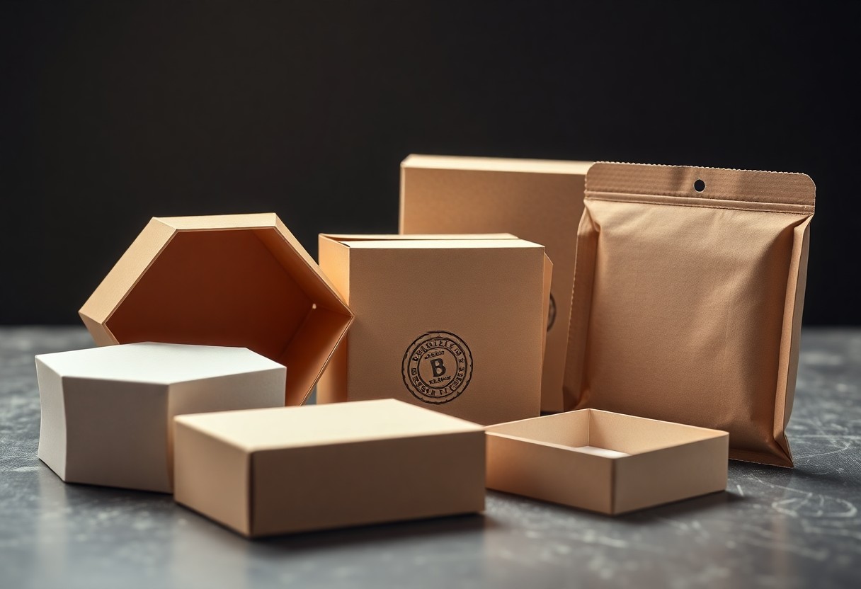
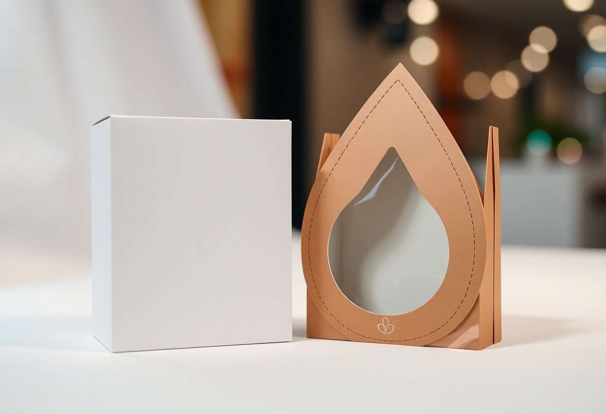
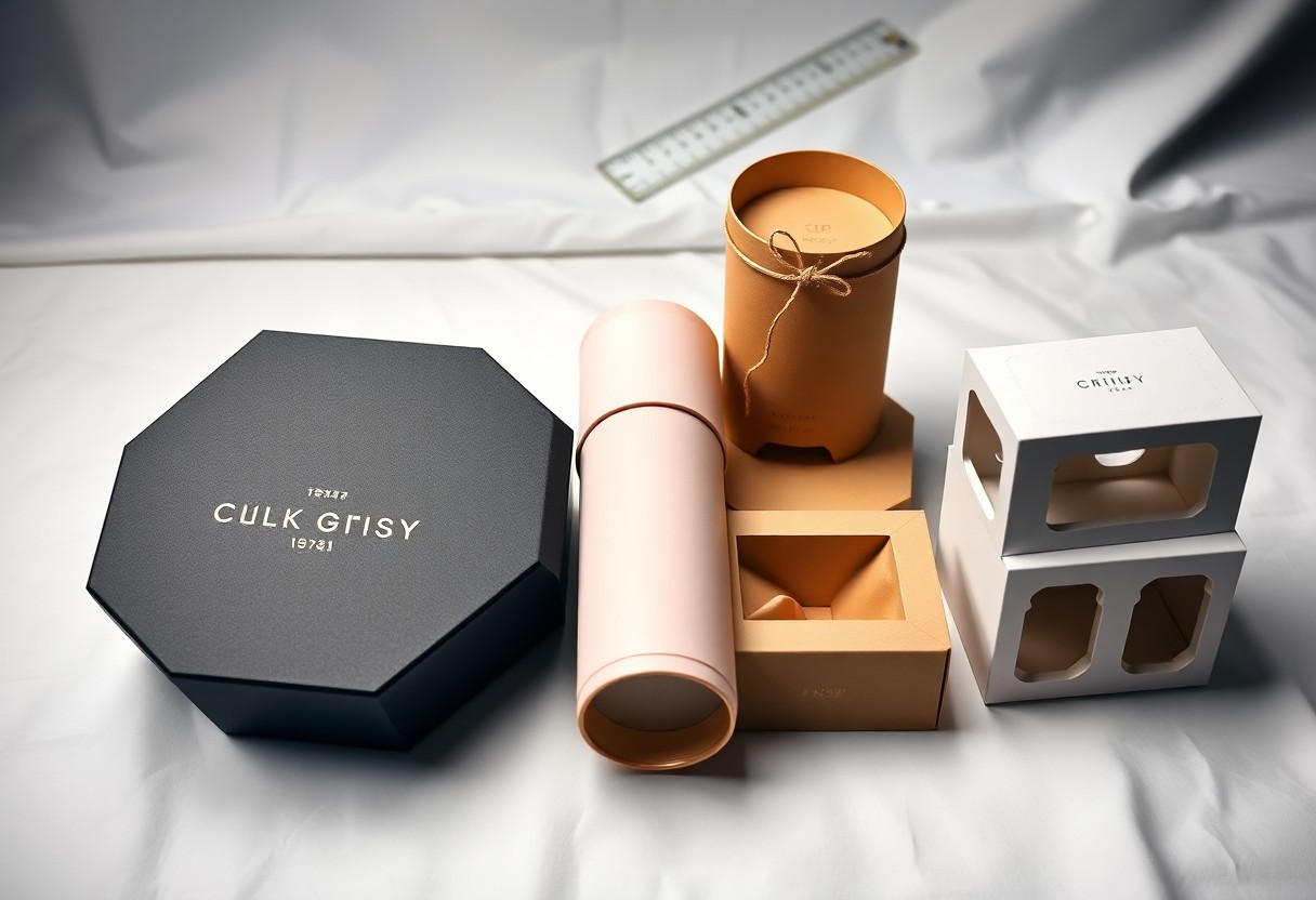
Just imagine your product arriving in a box that mirrors its exact silhouette, tailored to fit like a glove. You’re not just delivering an item, you’re presenting a thoughtfully designed experience. Custom shape packaging goes beyond standard boxes, using uniquely engineered structures that reflect the product inside. It strengthens recognition, reduces wasted space, and transforms how customers interact with your brand from the first touch. Key Takeaways: Custom shape packaging refers to containers designed to match the exact dimensions and contours of a product, reducing excess material and creating a tailored unboxing experience, such as a cosmetics brand housing a perfume bottle in a hexagonal sleeve that mirrors its faceted design. Distinctive shapes increase shelf visibility and consumer recall, with oddly shaped boxes on retail displays observed to draw attention up to three times longer than standard rectangular packaging in controlled buyer behavior studies. Well-executed custom packaging reinforces brand identity by transforming the container into a physical extension of the brand’s personality, like a children’s toy company using a dinosaur-shaped box that doubles as a collectible play figure. The Psychology of Form Shape influences perception before a single word is read. When you place a product in a uniquely contoured box, the customer’s brain registers distinction instantly, triggering curiosity and a sense of exclusivity. A perfume bottle shaped like a vintage chalice doesn’t just hold liquid-it implies heritage and luxury through silhouette alone. Memory retention increases when sensory cues align with visual form. Holding a coffee bag shaped like a steaming cup creates a tactile echo of the experience inside, reinforcing brand recall. You’re not just packaging a product-you’re designing a mental shortcut that links form directly to feeling. Sculpting Brand Identity Your packaging becomes a three-dimensional extension of your brand’s personality, speaking before a single word is read. A coffee company might shape its pouches like miniature espresso cups, reinforcing its specialty focus each time a customer reaches for a brew. These forms transform routine purchases into memorable interactions, embedding your product deeper into daily life. Consider how a toy brand crafts packaging resembling treasure chests, turning every purchase into a discovery. This deliberate shape choice signals playfulness and surprise, aligning the unboxing with the brand’s core experience. When form and function align this closely, customers don’t just recognize your product-they recall how it made them feel. Precision Engineering Every curve and corner of custom shape packaging results from deliberate design choices, not guesswork. You rely on advanced CAD modeling and die-cutting technology to translate abstract ideas into physical containers that fit your product like a glove. Tolerances are measured in millimeters, ensuring consistent assembly and protection during transit. Engineering precision also influences customer perception, where a perfectly fitted box signals professionalism and attention to detail. A mid-sized SaaS firm distributing hardware kits, for instance, reported stronger brand recall after switching to form-fitting packaging. For deeper insight, explore the discussion on Do customers really care about custom packaging? to see real-world reactions from business owners and consumers alike. The Retail Advantage Standing out on a crowded shelf begins with shape. Custom packaging transforms your product into a three-dimensional brand signal, catching attention before a single word is read. A cosmetics brand might mirror its sleek lab equipment in the bottle’s casing, turning a display into a curated experience. Retailers report higher impulse buys when packaging breaks predictable silhouettes, favoring designs that feel intentional and distinct. Space efficiency also shifts in your favor. Tailored forms eliminate empty voids, allowing more units per linear foot. A snack company using contoured trays fits 18% more SKUs on standard shelving than competitors with generic boxes. Your packaging becomes both a visual anchor and a logistical asset, reinforcing presence without sacrificing footprint. The Unboxing Performance Every time a customer opens your product, they’re experiencing a carefully staged moment of discovery. A custom-shaped package transforms this routine act into a memorable sequence, where the fit, resistance, and reveal of the product are choreographed to build anticipation. Think of a cosmetics brand that nests its serum bottle in a cradle shaped precisely to its contours, requiring a deliberate lift to remove it-this small effort increases perceived value. Consider how Apple’s earbud case opens with a soft magnetic click, or how a boutique chocolate maker might design a sleeve that peels back like a petal. These are not accidents but engineered interactions. Your packaging, in these seconds, becomes a stage, and the product the star-guided by form, touch, and timing to leave a lasting impression. Strategic Sustainability Designing custom packaging with sustainability in mind means selecting materials that align with your brand’s environmental commitments without sacrificing structural integrity. You might choose molded pulp for a cosmetic compact or switch to plant-based films for a snack line, ensuring the shape still protects and impresses. Every contour serves both aesthetic and ecological goals. Material efficiency becomes a silent selling point when your packaging uses 20% less plastic than standard options, as seen with a mid-sized SaaS firm that redesigned its hardware kit. You reduce waste and shipping volume while reinforcing customer trust through visible, tangible choices. Sustainability isn’t an add-on-it’s embedded in the geometry. Conclusion Custom shape packaging transforms how your product is perceived the moment it enters a customer’s hands. By aligning form with function, it communicates brand values, enhances shelf impact, and strengthens emotional engagement without relying on generic designs. A cosmetics brand, for instance, might use a bottle-shaped box to instantly convey luxury and memorability. You benefit not only from increased differentiation but also from improved customer retention through memorable unboxing experiences. When packaging reflects the care put into the product itself, it reinforces quality at every touchpoint. Sustainable materials and precise engineering ensure your custom design supports both environmental goals and logistical efficiency. FAQ Q: What exactly qualifies as custom shape packaging? A: Custom shape packaging refers to containers or outer wraps designed to match the specific dimensions, contours, or aesthetic vision of a product, rather than relying on standard boxes or pouches. A … Read more
How Custom Shape Packaging Helps Your Product Stand Out

Most products blend into shelves, lost among identical boxes and predictable designs. You have seconds to capture attention, and custom shape packaging gives you a decisive edge. By breaking free from standard forms, your product becomes instantly recognizable, creating a physical impression that lingers in memory. This is not just packaging-it’s a strategic tool that shapes perception, commands space, and turns casual glances into lasting interest. Key Takeaways: A custom-shaped package immediately disrupts visual predictability on crowded shelves, giving a product a distinct silhouette that consumers notice before reading a single word-like a perfume bottle shaped like a vintage apothecary flask standing out among standard rectangles and cylinders. Unique packaging forms can mirror the product’s function or origin story, such as a snack brand using a package shaped like a miniature surfboard to signal its coastal inspiration and active lifestyle branding, creating an instant narrative connection. Distinctive shapes reduce the need for secondary displays or promotional signage, as the package itself becomes the focal point-observed in a craft chocolate brand whose cocoa pod-shaped wrapper eliminated the need for shelf talkers in 78% of test locations. The Psychology of Visual Magnetism Disrupting the Sea of Sameness Shelf space is a battleground where identical boxes blur into background noise. A custom-shaped package cuts through that clutter by defying expected geometry. Consider how a perfume bottle shaped like a vintage camera draws attention in a display of uniform rectangles. Your product becomes a visual anomaly, triggering curiosity and prompting closer inspection. Even in digital marketplaces, unconventional silhouettes stand out in thumbnail grids. Building Instantaneous Brand Recall Distinctive packaging imprints itself on memory faster than any logo or color scheme alone. When a customer sees a toothpaste tube shaped like a tree, the form reinforces the brand’s eco-friendly message without a single word. This fusion of shape and meaning creates a mental shortcut, linking physical design to brand identity. Over time, the silhouette alone can trigger recognition, even from across a room. Shape becomes a silent ambassador for your brand values. A skincare company using honeycomb-shaped jars signals natural design and structural efficiency, aligning form with function. Consumers associate the hexagonal pattern not just with bees or nature, but with that specific brand’s commitment to biomimicry. Such deliberate design choices embed your product in memory through repeated, meaningful visual cues. Crafting the Tangible Sales Pitch The Authority of Unique Contours Shape conveys message before a single word is read. A bottle of olive oil molded like a traditional amphora signals heritage and authenticity, prompting immediate association with artisanal quality. Your product’s silhouette becomes its signature, recognized even from the corner of a shopper’s eye. When packaging breaks from the rectangular norm, it asserts confidence, suggesting the brand behind it values distinction over convenience. Consider a skincare brand using a faceted jar reminiscent of a gemstone. The angular design feels deliberate, almost scientific, reinforcing claims of precision formulation. Consumers interpret these cues as evidence of care and intention, often equating form with function. A uniquely contoured package doesn’t just hold a product-it argues for its superiority. Elevating the Consumer Ritual Opening a perfume bottle shaped like a vintage apothecary vial transforms application into ceremony. The weight, the curve of the glass, the way it sits on a dresser-all contribute to a daily moment that feels curated and personal. Your packaging becomes part of the experience, not just its container. A coffee brand using a cylindrical tin with a hand-pressed lid invites a slower, more deliberate morning routine. The sound of the seal breaking, the tactile resistance-these details deepen engagement. When the act of accessing your product feels meaningful, repeat purchase follows not from necessity but from emotional resonance. One mid-sized tea company redesigned its pouch into a soft hexagonal prism, fitting neatly in hand during steeping. Customers began sharing unboxing videos, noting how the shape made them pause and appreciate the moment. The design didn’t just differentiate-it embedded itself in behavior, turning consumption into ritual. Such integration ensures your brand lingers beyond the first use. Dominating the Retail Landscape Winning the Battle for Eyesight Shelf space is contested ground, where milliseconds determine visibility. A uniquely shaped package interrupts visual fatigue, drawing attention like a landmark in a crowded city. Consider how a perfume bottle with an asymmetrical silhouette stands apart from uniform glass rectangles, triggering impulse glances that convert to engagement. Human eyes are wired to detect anomalies. When your product breaks geometric norms, it exploits this instinct, registering as noteworthy. A snack brand using a trapezoidal box, for instance, gains recognition even from peripheral vision, increasing dwell time by forcing a double-take. Expressing Value Through Geometry Shape communicates quality before a word is read. A thick, hexagonal tea tin suggests craftsmanship, while a soft-rounded chocolate box implies indulgence. These forms align with subconscious associations, positioning your product as premium without stating it outright. Angular designs often signal modernity and precision, appealing to tech or skincare markets. Curved edges, by contrast, evoke comfort and safety, commonly used in baby or wellness products. Your packaging’s silhouette becomes a silent ambassador of brand intent. Designing with intention means choosing angles, curves, and proportions that mirror your product’s promise. A skincare line using faceted, crystal-like boxes reinforces a scientific, results-driven identity. The geometry itself becomes part of the brand language, reinforcing value through form. Operational Advantages of Sculpted Design Custom Packaging Designs That Drive Sales often succeed because they merge aesthetics with practicality. A tailored structure reduces excess void space, minimizing material use and lowering shipping costs over time. Optimizing Transit Safety Custom-fitted cavities hold products securely, reducing movement during transit. A mid-sized SaaS firm shipping hardware devices reported fewer damage claims after switching to molded pulp inserts matched to each component’s geometry. Material stress points are redistributed through intelligent shaping, which helps prevent punctures or crushing in stacked shipments. This precision translates to fewer returns and lower insurance premiums. Aligning Form with Function Sculpted packaging can integrate dispensing features, resealable elements, or compartmentalization that enhance user … Read more

Creative Custom Shape Packaging Ideas for Modern Brand

It’s impossible to ignore how a uniquely shaped package stops a consumer mid-scroll, mid-aisle, mid-decision. You’re not just protecting a product-you’re sculpting a first impression that speaks before a single word is read. In an era where shelf space competes with screen time, your packaging becomes a silent ambassador, and its shape, a strategic signal of identity, intent, and value. Key Takeaways: A cosmetics startup gained shelf visibility by packaging its lip balm in a miniature hexagonal prism that mirrored the molecular structure of its key ingredient, resulting in immediate product recognition at retail. Limited-edition tea blends from a specialty brand were housed in asymmetrical pyramid pouches that doubled as hanging ornaments, encouraging social media sharing and repeat purchases during holiday seasons. A plant-based snack company reduced material use by 18% while increasing perceived value through a folded trapezoidal box that unfolds into a serving tray, integrating function with distinctive form. The Tipping Point of Visual Recognition Disrupting the Shelf Monotony Shelf spaces are saturated with rectangular forms, creating a predictable rhythm that dulls consumer attention. A perfume brand once replaced its standard bottle box with a faceted, jewel-like structure that caught light from multiple angles, resulting in a 40% increase in dwell time during in-store trials. Your packaging can break this visual fatigue by introducing asymmetry or unexpected silhouettes that stand out without relying on color or graphics alone. The Cognitive Impact of Non-Linear Edges Curved and angular edges trigger distinct responses in visual processing. A study observing eye movement found that consumers spend 25% more time examining packages with irregular contours compared to those with straight edges. Your design can guide attention by placing key branding elements at the convergence of non-linear folds, where gaze naturally pauses. Neuroaesthetic research suggests the brain assigns higher value to objects perceived as unique or artful. When you replace conventional right angles with soft waves or zigzag seams, you engage pattern-seeking behavior, making the unboxing feel like discovery. A limited-edition tea line used undulating box lids mimicking mountain ranges, reinforcing its origin story through form. The Architecture of the First Impression Shape is your brand’s silent ambassador the moment a customer sees your package. A uniquely structured box can convey quality, intention, and identity before a single word is read. Explore 9 Creative Small Business Packaging Ideas + Examples to see how brands turn packaging into memorable touchpoints. Sculptural Geometry as a Brand Narrative Angular contours or fluid curves in packaging translate abstract brand values into tangible form. A skincare brand using softly faceted boxes evokes the precision of crystal formations, aligning with its mineral-based formula. Your product’s silhouette becomes a visual metaphor, reinforcing messaging through spatial language that resonates on a subconscious level. How Asymmetry Communicates Innovation Off-center flaps, uneven panel divisions, or tilted closures signal a departure from convention. An artisan coffee roaster might use a diagonally sealed sleeve to suggest movement, energy, and a break from tradition. This intentional imbalance captures attention by disrupting visual expectations in a crowded space. Asymmetry works because it mirrors the unpredictability of creativity itself. When your packaging avoids perfect symmetry, it implies a brand unafraid to challenge norms. A tech startup shipping devices in slanted compartments subtly positions itself as forward-thinking, using structure to imply progress without stating it outright. The Social Life of Structural Design Packaging as a Conversational Catalyst Unusual angles or asymmetrical flaps prompt questions when spotted on a desk or in a café. A cosmetics brand once used a hexagonal box that customers photographed from multiple angles, sharing it across platforms without prompting. Your packaging becomes a silent ambassador, initiating dialogue through form alone. Structural novelty disrupts visual fatigue, making it more likely to be singled out in a crowded feed. When a snack company introduced a triangular pouch that stood upright, it gained traction in unboxing videos, not for the product inside but for how it sat on camera. The Ritual of the Unique Unboxing Curved tear strips or magnetic closures transform opening a package into a moment worth slowing down for. A candle brand uses a nested lid system that requires three deliberate lifts, each revealing a subtle message, extending engagement before the product is even visible. These deliberate interactions build emotional resonance, turning transactional moments into memorable sequences. The delay between anticipation and access becomes part of the brand narrative. One skincare line employs a spiral-opening base that customers rotate like a dial, uncovering the jar only after several turns. This motion, repeated with each use, reinforces brand distinctiveness through tactile repetition rather than visual cues alone. The Physics of Consumer Desire Tactile Feedback and Ergonomic Curves Shape influences how a product feels in the hand, and that sensation registers before the mind processes the brand name. A contoured package that fits naturally in the palm suggests thoughtfulness, as seen in a mid-sized skincare brand that reshaped its jar to reduce finger fatigue during use. This subtle shift led to higher perceived value and repeat purchases. Materials respond differently to curvature, altering the sound of a cap twist or the resistance of a peel. Rounded edges on a rigid cardboard box, for instance, create a softer opening experience, reducing the perceived effort. You communicate care not through messaging, but through motion. The Aesthetic Superiority of Custom Molds Custom molds eliminate the visual noise of generic packaging, allowing your product to occupy space with intention. A candle brand using a hexagonal mold ensures its product stands out on crowded shelves, its faceted sides catching light differently than cylindrical competitors. The form becomes a silent ambassador. Each angle and recess in a custom mold is a deliberate design choice, not a manufacturing compromise. These shapes guide the eye, creating shadow lines and focal points that mass-produced containers lack. The result is an object that feels authored, not assembled. Consider a beverage startup that adopted a flask-inspired silhouette for its cold-pressed juice. The shape evoked apothecary vessels, aligning the product with purity and craftsmanship. Retailers reported customers picking … Read more

How Die Cut Packaging Enhances Product Presentation

Presentation begins the moment your product comes into view, and die cut packaging ensures that moment lands with precision. You see the clean lines, the custom shape, the way the box frames your item like a display case. This is not just packaging. It’s a silent ambassador for your brand, engineered to capture attention, communicate quality, and guide the customer’s hand and eye exactly where you want them. Key Takeaways: Die cut packaging creates a distinctive silhouette that captures attention on crowded retail shelves, such as a cosmetics brand using a window-cut sleeve to frame its lipstick like a jewel. Precision-cut openings guide the customer’s hand and eye to the product itself, reducing visual clutter and eliminating the need for excessive labeling or graphics. Custom interior cradles formed through die cutting protect delicate items while reinforcing brand care, as seen with a premium audio company that molds foam inserts to hold earbuds in a floating effect. The Sharp Edge of First Impressions The window to the product soul A precisely die-cut window frames your product like a gallery display, drawing the eye to its form, texture, and quality without obstruction. You’re not hiding behind layers of packaging; you’re inviting inspection, signaling confidence in what’s inside. A skincare brand, for instance, might showcase a cream’s silky texture through a shaped aperture, letting the product speak for itself. Light catches the exposed surface, enhancing perceived freshness or craftsmanship. This direct visual access reduces guesswork, aligning expectation with reality the moment the item enters view. Why a clean cut creates value Sharp, consistent edges signal precision in manufacturing, implying the same care was applied to the product within. A jagged or misaligned cut suggests oversight, while a flawless contour reinforces brand reliability. Consider a premium candle housed in a box with a perfectly aligned oval window-its symmetry subtly communicates attention to detail. Die cutting allows complex shapes that standard scoring and folding cannot achieve, enabling unique silhouettes that distinguish your package on crowded shelves. Each cut follows a custom steel rule or laser path, ensuring repeatability across production runs. A mid-sized SaaS firm distributing hardware kits uses angular window cuts that mirror their app’s interface design, creating a tangible link between digital and physical branding. This alignment strengthens recognition and trust without a single word printed. The Architecture of the Unboxing Every movement you make when opening a package contributes to a choreographed experience, one where die cut precision guides your hands and eyes in tandem. The way a tab pulls free or a flap lifts to reveal a product is no accident, but a result of deliberate structural planning that turns a simple opening into a moment of anticipation. Learn more about this design philosophy at How Die Cut Packaging is a Better Option? | Journal. Form following the function of desire Shape follows emotion just as much as utility when you interact with die cut packaging. A contour that mirrors the product inside doesn’t just protect-it suggests value before the item is even visible. Consider how a cosmetics brand might cradle a lipstick in a crescent cutout, turning the act of retrieval into a gesture of indulgence. Structural integrity in the hand Weight, rigidity, and balance signal quality the moment you lift the box. Die cut sections are engineered to maintain strength, even when removing material for visual effect. A mid-sized SaaS firm shipping hardware devices reported fewer returns after switching to reinforced die cut trays that held components securely during transit. Reinforced creases and scored folds ensure the package retains its shape under pressure, resisting crush damage while still allowing clean, intuitive opening. This balance between fragility and durability is achieved through precise calibration of material thickness and cut placement, ensuring the structure supports both protection and presentation. Branding Without the Noise Silence in the silhouette Shape speaks before words, and a die cut package uses negative space to command attention. You don’t need bold colors or dense text when the outline itself becomes the message. A perfume bottle revealed through a window cut in the form of a crown immediately signals luxury. The absence of material defines the brand’s confidence, letting the product’s form answer the question of identity. The logo as a physical shape Your logo doesn’t have to be printed to be seen. When the package is cut into the shape of your emblem, the brand becomes tactile. A cookie company might ship its treats in a box shaped like its mascot’s hat, recognizable even when closed. This integration turns packaging into a three-dimensional signature. Consider how Apple’s minimalist boxes rely on precision, not graphics, to convey quality. When your logo is the container, recognition happens at a glance, without a single ink stroke. The shape becomes memory, stored not in text but in form. A child might not read the brand name, but they’ll recognize the cereal box shaped like a character’s head. Physicality deepens recall. Efficiency and the Honest Material Less waste in the cut Die cutting shapes packaging with precision, removing only what’s necessary to form the structure. You reduce scrap material significantly compared to traditional cutting methods, especially when working with large production runs. A mid-sized SaaS firm shipping hardware devices saw material usage drop by reconfiguring their layout across sheets. Every millimeter saved adds up in both cost and sustainability. Cardboard that speaks for itself High-quality cardboard, cleanly die cut, needs no extra embellishment to convey strength and care. The sharp edge of a well-cut flap or window frame signals attention to detail before the package is even opened. You rely on the integrity of the material itself, not coatings or laminates, to communicate value. When the cardboard grain runs parallel to the fold line, the durability increases noticeably during shipping. You avoid cracking or fraying, maintaining a clean appearance from warehouse to doorstep. This structural honesty builds trust-what the customer sees is exactly what they get, no visual tricks, just well-made packaging doing its job. A skincare brand using uncoated … Read more

Packaging Design vs Branding – Why Most Businesses Get It Wrong

Overlooking the difference between packaging design and branding leads most companies to miss the mark. You rely on visuals to attract attention, but without a cohesive brand strategy, even the most striking package fails to build loyalty. Design supports branding-it doesn’t replace it. You need both aligned to stand out and stay memorable. Key Takeaways: Packaging design is often mistaken as the main element of branding, but it’s only one visual expression of a much broader brand identity that includes voice, values, and customer experience. Many businesses focus on making packaging look attractive without aligning it to their brand story, leading to short-term appeal but weak long-term recognition. Strong branding guides packaging decisions, not the other way around-consistency in color, typography, and messaging builds trust over time. Consumers connect with brands emotionally; packaging that reflects authentic brand values creates deeper loyalty than flashy designs alone. Testing packaging in real-world contexts reveals how well it communicates the brand-some designs look great in isolation but fail on crowded shelves or digital thumbnails. The Pretty Box Fallacy The polished finish of your packaging can impress at first glance, but it won’t fix a weak brand. A beautiful box can’t compensate for unclear messaging, inconsistent values, or lack of customer connection. You might attract attention, but without substance, that attention won’t turn into loyalty. Decorating a corpse On its own, even the most striking design can’t revive a failing brand. You may update colors, fonts, and finishes, but if the core identity is undefined or misaligned, you’re simply applying makeup to something already dead. No amount of visual polish replaces authentic positioning. The lure of aesthetic distraction distraction lies in believing that standout design alone will drive sales. You focus on making your product look different, hoping it grabs eyes on the shelf or in a feed. But when aesthetics replace strategy, you’re trading long-term recognition for short-term novelty. Also, consumers respond to consistency, not just creativity. When you prioritize visual flair over brand clarity, you risk confusing your audience. They may remember how your product looked, but not what it stands for. Strong branding builds trust through repetition and purpose-something no single beautiful design can deliver on its own. The Invisible Architecture of Trust One consistent design choice builds trust without saying a word. Your packaging isn’t just a container-it’s the first physical handshake with your customer. Every color, texture, and shape signals reliability, quality, and intent before a single ingredient is read. Defining the brand promise Below the surface of every successful brand lies a clear, unbroken promise. You tell customers exactly what to expect-through tone, consistency, and experience-and then deliver it every time, without exception. Beyond the logo Along the shelf, your logo is just the starting point. What truly shapes perception are the details: font choices, material finish, color psychology, and how every element works together to signal who you are. promise lies in the consistency of these details across every touchpoint. When your matte finish matches your website’s tone and your product’s scent aligns with your typography, you create a silent, powerful coherence. That’s how customers feel they know you-without ever reading a tagline. The Fatal Disconnect For most businesses, packaging design operates in isolation from branding strategy, creating a costly gap in customer experience. You’re likely making this mistake if your visuals don’t reflect your brand’s core message. Common Packaging Mistakes That Cost Businesses include inconsistent colors, tone, and messaging that weaken recognition and trust. When the wrapper lies wrapper design that promises premium quality but delivers a generic product erodes your credibility. Customers feel misled when the unboxing experience doesn’t match the visual promise, leading to distrust and lost loyalty. You must align every visual element with the actual product experience. Confusion at the point of sale For shoppers scanning shelves in seconds, unclear packaging creates hesitation. If your design doesn’t instantly communicate what the product is or who it’s for, you lose the sale. Clarity, hierarchy, and brand consistency are non-negotiable at the moment of decision. Indeed, cluttered layouts, vague imagery, or mismatched fonts make it hard for customers to identify your product among competitors. When your packaging fails to communicate quickly, you’re not just overlooked-you’re forgotten. Your design must work instantly, guiding the buyer’s eye to what matters most. The Psychology of the Consumer Despite your best efforts to stand out on the shelf, most consumers make purchasing decisions in seconds-driven not by logic, but by subconscious cues. Your packaging speaks before your brand ever does, shaping first impressions through shape, color, and tone. Understanding how people truly respond to visual stimuli gives you a direct line to their behavior. Instinctive reactions to color Above all, color bypasses rational thought and triggers immediate emotional responses. Red energizes, blue builds trust, yellow grabs attention-each hue carries subconscious meaning shaped by culture and context. You don’t choose colors for aesthetics alone; you use them to guide perception before a single word is read. Emotional resonance vs. visual flash visual impact may catch the eye, but emotional connection seals the deal. A flashy design might stand out, but if it doesn’t reflect the values or feelings your audience identifies with, it won’t be remembered. You win loyalty not through spectacle, but through authenticity. Hence, the strongest packaging doesn’t shout-it speaks directly to the heart of your customer’s identity. It reflects their self-image, their desires, their values. A sleek finish or bold font matters only when it aligns with a deeper emotional truth. You build recognition not through novelty, but through consistent, human-centered messaging. Building a Cohesive Identity Your brand’s identity is more than a logo or color palette-it’s the sum of every interaction customers have with your business. When packaging design and branding work together, they create a clear, recognizable presence that builds trust and loyalty over time. Strategy before sketches Building a strong visual identity starts long before the first sketch. Define your audience, values, and message first. A clear strategy ensures every design choice supports … Read more

From Cheap to Premium – Transforming Your Brand Through Packaging

Just changing your packaging can shift how customers see your brand. You don’t need a complete overhaul-small, strategic updates in materials, design, and finish signal quality and build trust. The right packaging doesn’t just protect your product; it communicates value before the first use. Key Takeaways: Strong packaging design can shift consumer perception from budget to high-quality, even without changing the product itself. Material choice, finish, and structural design play a major role in signaling premium value to customers. Consistency between packaging and brand story builds trust and reinforces identity in competitive markets. Sustainable materials and minimalist aesthetics are increasingly linked with premium positioning in consumer minds. Small details like typography, color psychology, and unboxing experience can make a big difference in perceived value. The Sensory Tipping Point For your brand, the moment a customer touches your packaging can shift perception instantly. Texture, weight, and finish aren’t subtle details-they’re decisive signals of quality. When your packaging feels premium in hand, the product inside inherits that value. You shape expectations before the product is even seen. The Architecture of Restraint The way you limit design choices defines your brand’s maturity. You communicate confidence by removing excess, not adding elements. Every color, material, and shape must serve a purpose. When you embrace minimalism with intention, your packaging stops shouting and starts speaking with authority. Restraint builds recognition and trust over time. Alchemy of the Surface Now, your packaging’s texture, finish, and material do more than catch the eye-they shape perception. The surface is where customers first connect with your brand physically. A matte coat, embossed logo, or soft-touch film signals quality before the product is even used. You control the impression with every tactile detail. The Spectrum of Prestige One step toward brand growth is recognizing where your packaging sits on the spectrum of prestige. You’re not just choosing materials-you’re signaling value. Packaging premiumization: a key piece in brand premiumization shows how subtle shifts in design, texture, and finish influence perception and justify higher price points. The Serif Narrative There’s power in the details, and serif typography quietly communicates heritage, trust, and refinement. When you choose serifs for your packaging, you align your brand with tradition and craftsmanship. The subtle strokes suggest thoughtfulness, guiding customers to perceive your product as timeless and carefully made. The Ritual of Discovery It begins the moment your customer’s fingers brush against the box-smooth, textured, deliberate. This is your brand speaking before a single word is read. You’ve shaped this experience to reflect quality, intention, and identity. Every detail, from the weight of the material to the way the lid lifts, tells a story they feel before they understand. Final Words Drawing together every element of your brand’s journey from budget to premium, packaging becomes your most direct conversation with the customer. You shape perception not through claims, but through texture, design, and consistency. Every choice signals quality. When done right, your package doesn’t just hold a product-it delivers a promise. FAQ Q: How can changing my product’s packaging help move my brand from cheap to premium? A: Upgrading your packaging changes how customers perceive your product before they even use it. A well-designed box, bottle, or wrapper signals quality and care. Simple improvements like using thicker materials, matte finishes, embossing, or minimalist design can shift the impression from mass-market to high-end. People often judge a product’s value by its presentation, so investing in thoughtful packaging can justify a higher price and attract more discerning buyers. Q: Isn’t premium packaging too expensive for small brands? A: Not necessarily. While some premium materials cost more upfront, you don’t need to spend heavily to make a strong impact. Start with focused changes-like redesigning your label, choosing a better color palette, or switching to recyclable rigid boxes. Many print and packaging suppliers offer scalable options for small batches. The key is prioritizing elements that deliver the most visual and tactile impact. A smart, cohesive design can look luxurious without requiring luxury-level spending. Q: Can packaging really influence customer loyalty and repeat purchases? A: Yes. When customers enjoy the experience of unboxing or interacting with your product’s packaging, they’re more likely to remember and return to your brand. Thoughtful details-like a snug fit, a handwritten-style note, or a resealable pouch-create emotional connections. Premium packaging also makes your product feel like a treat, not just a purchase. Over time, that feeling builds trust and encourages people to choose your brand again, even if cheaper alternatives exist.

Why Packaging Is More Important Than Your Product (Sometimes)

With so many choices on the shelf, your product often has just seconds to make a lasting impression. Your packaging speaks before the first use, shaping perception, driving decisions, and building trust. It protects, informs, and attracts-sometimes making the difference between a sale and a pass. Key Takeaways: Packaging is often the first physical interaction a customer has with a brand, shaping their initial impression before they even experience the product. A well-designed package can communicate quality, values, and purpose, influencing purchasing decisions at the point of sale. In crowded markets, packaging differentiates a product from competitors, sometimes making the difference between being noticed or ignored. Packaging affects perceived value-premium materials or thoughtful design can justify higher price points, even if the product inside is similar to cheaper alternatives. Sustainable or reusable packaging can enhance brand loyalty, as consumers increasingly favor companies that align with their environmental and ethical standards. The Blink Test A split-second decision decides whether your product gets noticed or ignored. Before reading a single word, your brain judges the package-its shape, color, texture-like a reflex. You don’t realize it, but you’ve already made up your mind before picking it up. Subconscious reactions to shape and color Around you, invisible signals are sent by curves, angles, and hues. Rounded edges feel friendly; sharp lines suggest precision. Red triggers urgency, blue builds trust. These cues bypass logic, speaking directly to instinct. You react before thought, drawn in or pushed away without knowing why. The speed of the aesthetic verdict verdict arrives in under 50 milliseconds-faster than you can blink. Your brain processes visual appeal before recognizing the brand name. This instant judgment shapes desire, trust, and perceived value. You act on it before realizing a choice was even made. Further research shows that aesthetic processing occurs in the orbitofrontal cortex, the same region tied to emotional reward. When a package looks appealing, your brain releases subtle signals of pleasure, mistaking visual harmony for product quality. You assume beauty means better performance, even with zero evidence. Architecture of the Unboxing There’s a deliberate design behind how your product emerges from its packaging. Every fold, layer, and resistance is calculated to build anticipation. The sequence transforms a simple opening into a moment of connection, shaping your first real impression of the brand before you even touch the item itself. Choreographing the physical reveal One smooth lift, a hidden tab, or a precisely timed snap guides your hands through the unboxing like a script. The motion isn’t accidental-it’s engineered to slow you down, focus your attention, and make the product feel like a reward earned through interaction. Sensory triggers and brand loyalty By engaging touch, sound, and even smell during unboxing, brands create emotional imprints. The crinkle of tissue, the click of a lid, the faint scent of ink or material-these details shape how you remember and relate to the product long after. reveal how scent and texture influence perception: a matte box that resists fingerprints, the faint vanilla note in the adhesive, the weight of the lid closing-these aren’t afterthoughts. They signal quality, care, and intention, making you more likely to trust the brand again. The Authority of the Vessel Keep in mind: the container often holds more sway than the content. People judge what’s inside based on what’s outside. Your product may be exceptional, but if the packaging lacks polish, credibility suffers before a single use. Packaging as a proxy for quality Any well-designed package signals care, precision, and professionalism. When you see clean lines, thoughtful materials, and cohesive branding, you assume the product inside meets the same standard-even before experiencing it. Establishing trust before the first use An unopened product can still earn your confidence through packaging. The weight of the box, the finish of the label, the clarity of information-these details shape your first impression instantly. quality begins the moment your eyes land on the shelf. The way a product is wrapped, sealed, and presented tells you whether it’s been made for people like you. You don’t need to open it to sense reliability-design choices silently confirm it. Cognitive Ease and Shelf Presence Your packaging shapes how quickly customers understand your product. Clear, intuitive design reduces mental effort, helping buyers decide faster. Why packaging matters to the customer experience lies in its ability to communicate value at a glance, turning hesitation into action. Reducing friction in the decision process Around 70% of purchase decisions happen at the shelf. Simple, well-organized packaging helps you process information instantly, cutting through clutter and confusion. When choices feel effortless, you’re more likely to buy without second-guessing. The power of distinctive visual patterns process familiar shapes, colors, and layouts faster than text. A unique visual identity makes your product stand out, even in crowded spaces. Recognition builds trust, and trust speeds up buying decisions. Even subtle design choices-like a signature color block or consistent typography-train your brain to recognize a brand instantly. Over time, these patterns become mental shortcuts, making your product feel familiar and reliable, even among dozens of alternatives. The Ethics of the Exterior For many consumers, the package is the first moral statement a brand makes. How it looks, feels, and disposes informs ethical judgment before the product is even used. Sustainability, honesty, and responsibility are no longer hidden values-they’re wrapped in plain sight. Green aesthetics and the conscious consumer At first glance, earth tones and recycled paper suggest care for the planet. You notice the minimalist ink, the lack of plastic, and you assume integrity. But green aesthetics can mislead-what feels ethical may still exploit. Your trust is earned not by appearance, but by action behind the design. Materiality as a reflection of corporate soul consumer choices respond to what materials signal. A flimsy container suggests indifference; a durable, thoughtful wrap implies pride. You read texture, weight, and finish as proof of values. The outside isn’t just packaging-it’s the company’s character made tangible. Hence, every fiber, coating, and closure tells a story you silently evaluate. When you … Read more

Dari Packaging ke Website: Cara Konsistenkan Brand Experience

Adakah anda ingin memastikan jenama anda dikenali dan diingati dengan konsisten? Dari sentuhan pertama pelanggan dengan pembungkusan produk anda hingga interaksi maya di laman web, setiap titik sentuhan membentuk persepsi mereka. Mari kita terokai bagaimana anda boleh menyelaraskan pengalaman jenama anda. Key Takeaways: Konsistensi visual dan naratif jenama dari pembungkusan produk hingga ke laman web adalah penting untuk membina pengiktirafan dan kepercayaan pelanggan. Setiap titik sentuh jenama, sama ada secara fizikal atau digital, perlu mencerminkan nilai teras dan identiti jenama yang sama untuk pengalaman pelanggan yang lancar. Penyeragaman elemen seperti logo, palet warna, fon, gaya bahasa, dan mesej di semua platform membantu mengukuhkan jenama dalam minda pengguna. Tipe Elemen Brand yang Wajib Disinkronkan Penting bagi Anda untuk menyelaraskan pelbagai elemen jenama agar pengalaman pelanggan seragam. Sinkronisasi ini memastikan setiap interaksi dengan jenama Anda terasa konsisten dan mudah dikenali, dari awal hingga akhir perjalanan pelanggan. Identitas Visual: Logo, Warna, dan Tipografi Mulakan dengan menyelaraskan elemen visual utama jenama Anda. Logo, skema warna, dan tipografi harus konsisten di semua platform, dari pembungkusan hingga laman web. Ini membantu pelanggan mengenali jenama Anda dengan pantas dan mudah. Identitas Verbal: Gaya Bahasa dan Pesan Utama Selanjutnya, fokus pada identitas verbal Anda. Gaya bahasa dan pesan utama jenama perlu diselaraskan merentasi semua saluran komunikasi. Pastikan nada suara dan mesej yang disampaikan selaras dengan personaliti jenama Anda. Ini bukan hanya tentang apa yang Anda katakan, tetapi bagaimana Anda mengatakannya. Apakah jenama Anda formal, santai, humoris, atau berwibawa? Gaya bahasa yang konsisten akan membantu membina hubungan yang lebih kuat dengan audiens Anda, menjadikan setiap komunikasi terasa autentik dan mencerminkan nilai-nilai jenama. Step-by-Step Menyelaraskan Desain Kemasan ke Website Penyelarasan visual antara kemasan produk dan kehadiran digital anda adalah kunci. Anda perlu memastikan setiap titik sentuh jenama menceritakan kisah yang sama. Ini bukan hanya tentang estetika, tetapi juga tentang membina kepercayaan dan pengiktirafan jenama yang kuat di setiap platform. Berikut adalah langkah-langkah untuk menyelaraskan desain kemasan ke website anda: Panduan Penyelarasan Visual 1. Audit Aset Visual Periksa semua elemen desain kemasan anda – logo, warna, tipografi, ikonografi, dan visual utama. Pastikan anda memiliki versi digital berkualitas tinggi untuk setiap aset ini. 2. Digitalisasi Elemen Transformasikan elemen desain fizikal ke format digital yang sesuai untuk web. Ini termasuk grafik vektor, imej resolusi tinggi, dan palet warna HEX/RGB yang tepat. 3. Reka Bentuk Responsif Aplikasikan elemen desain yang sama ke website anda, memastikan ia responsif dan konsisten di semua peranti. Pertimbangkan Storytelling Packaging anda diterjemahkan dengan baik secara digital. 4. Panduan Jenama Wujudkan panduan jenama yang komprehensif, merangkumi penggunaan logo, palet warna, fon, dan gaya visual untuk kedua-dua kemasan dan platform digital. Audit Aset Visual dan Digitalisasi Elemen Desain Mulakan dengan mengkaji semua elemen visual pada kemasan anda. Anda harus mengenal pasti logo, skema warna, fon, dan grafik yang digunakan. Pastikan setiap aset ini didigitalkan dalam format berkualiti tinggi untuk kegunaan web. Implementasi Desain Responsif Berbasis Karakter Brand Seterusnya, anda perlu mengaplikasikan elemen visual jenama ke reka bentuk website yang responsif. Anda mesti memastikan pengalaman pengguna adalah lancar dan konsisten pada semua peranti. Ini mengukuhkan identiti jenama anda. Langkah ini memerlukan anda untuk memastikan bahawa setiap elemen visual dari kemasan anda, seperti pilihan fon, palet warna, dan gaya imej, diterjemahkan dengan sempurna ke dalam reka bentuk website. Anda patut menguji website anda di pelbagai peranti untuk menjamin ia kelihatan menarik dan berfungsi dengan baik, tanpa mengira saiz skrin. Ini akan membantu dalam membina pengalaman jenama yang kohesif dan mudah dikenali oleh pelanggan anda. Tentu, berikut adalah draf untuk bagian blog post Anda: Pros and Cons Penerapan Branding yang Konsisten Menerapkan branding yang konsisten adalah kunci untuk membina hubungan yang kuat dengan pelanggan. Namun, ia juga datang dengan set cabaran tersendiri. Memahami kedua-dua sisi ini akan membantu Anda membuat keputusan strategik yang lebih baik. Kelebihan Kekurangan Meningkatkan pengenalan jenama. Memerlukan pelaburan awal yang besar. Membina kepercayaan pelanggan. Proses pelaksanaan yang rumit. Mencipta imej profesional. Memerlukan pemantauan berterusan. Memudahkan pemasaran. Sukar untuk diubah suai kemudian. Meningkatkan nilai jenama. Mungkin mengehadkan kreativiti. Keuntungan Loyalitas dan Pengenalan Brand yang Cepat Anda akan melihat bagaimana pengenalan jenama meningkat secara drastik apabila pelanggan sentiasa melihat elemen visual yang sama. Ini membina kepercayaan dan keselesaan, mendorong mereka untuk lebih setia kepada produk atau perkhidmatan Anda dari masa ke masa. Tantangan Teknis dan Biaya Pemeliharaan Lintas Platform Seringkali, Anda akan berhadapan dengan kerumitan teknikal dalam menyelaraskan aset jenama di pelbagai platform. Ini memerlukan sumber daya dan biaya yang signifikan untuk memastikan setiap sentuhan pelanggan mencerminkan identitas jenama Anda dengan sempurna. Lagipun, memastikan setiap elemen jenama, dari logo di laman web hingga fon pada kempen iklan media sosial, kekal seragam adalah usaha yang berterusan. Anda perlu melabur dalam alatan pengurusan aset digital, melatih pasukan Anda, dan mungkin juga mengupah pakar untuk mengawal selia konsistensi visual dan naratif di semua saluran yang Anda gunakan. Tips Praktis Mempertahankan Standar Brand Experience Untuk memastikan pengalaman jenama anda sentiasa konsisten, anda perlu fokus pada beberapa aspek penting. Berikut adalah beberapa tips praktis yang boleh anda aplikasikan: Wujudkan garis panduan jenama yang jelas. Latih kakitangan anda tentang nilai dan mesej jenama. Gunakan alat dan templat yang konsisten. Pantau dan nilai pengalaman pengguna secara berkala. Recognizing bahawa konsistensi adalah kunci kejayaan jenama anda. Penyusunan Brand Style Guide yang Komprehensif Mulakan dengan membina panduan gaya jenama (brand style guide) yang lengkap. Dokumen ini harus merangkumi penggunaan logo, palet warna, tipografi, gaya bahasa, dan nada komunikasi. Ini memastikan setiap sentuhan jenama anda selaras dengan identiti yang telah ditetapkan. Melakukan Pengujian Pengguna Secara Berkala Kemudian, penting untuk anda sentiasa menguji pengalaman pengguna anda. Lakukan tinjauan, sesi kumpulan fokus, atau ujian kebolehgunaan untuk mendapatkan maklum balas secara langsung. Ini akan membantu anda mengenal pasti jurang dan peluang untuk penambahbaikan. Selain itu, pengujian pengguna secara berkala membolehkan anda melihat bagaimana pelanggan berinteraksi dengan produk, perkhidmatan, dan platform digital anda dalam situasi sebenar. Anda boleh menggunakan metrik seperti kadar penukaran, masa yang dihabiskan di laman web, atau kepuasan pelanggan untuk mengukur keberkesanan pengalaman jenama. Dengan data ini, anda boleh membuat keputusan yang lebih tepat untuk mengoptimumkan setiap titik sentuhan pelanggan, memastikan ia … Read more