Alev

Dari Packaging ke Website: Cara Konsistenkan Brand Experience

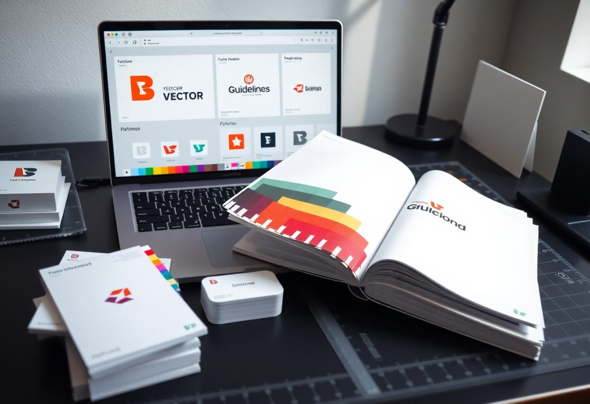
Adakah anda ingin memastikan jenama anda dikenali dan diingati dengan konsisten? Dari sentuhan pertama pelanggan dengan pembungkusan produk anda hingga interaksi maya di laman web, setiap titik sentuhan membentuk persepsi mereka. Mari kita terokai bagaimana anda boleh menyelaraskan pengalaman jenama anda. Key Takeaways: Konsistensi visual dan naratif jenama dari pembungkusan produk hingga ke laman web adalah penting untuk membina pengiktirafan dan kepercayaan pelanggan. Setiap titik sentuh jenama, sama ada secara fizikal atau digital, perlu mencerminkan nilai teras dan identiti jenama yang sama untuk pengalaman pelanggan yang lancar. Penyeragaman elemen seperti logo, palet warna, fon, gaya bahasa, dan mesej di semua platform membantu mengukuhkan jenama dalam minda pengguna. Tipe Elemen Brand yang Wajib Disinkronkan Penting bagi Anda untuk menyelaraskan pelbagai elemen jenama agar pengalaman pelanggan seragam. Sinkronisasi ini memastikan setiap interaksi dengan jenama Anda terasa konsisten dan mudah dikenali, dari awal hingga akhir perjalanan pelanggan. Identitas Visual: Logo, Warna, dan Tipografi Mulakan dengan menyelaraskan elemen visual utama jenama Anda. Logo, skema warna, dan tipografi harus konsisten di semua platform, dari pembungkusan hingga laman web. Ini membantu pelanggan mengenali jenama Anda dengan pantas dan mudah. Identitas Verbal: Gaya Bahasa dan Pesan Utama Selanjutnya, fokus pada identitas verbal Anda. Gaya bahasa dan pesan utama jenama perlu diselaraskan merentasi semua saluran komunikasi. Pastikan nada suara dan mesej yang disampaikan selaras dengan personaliti jenama Anda. Ini bukan hanya tentang apa yang Anda katakan, tetapi bagaimana Anda mengatakannya. Apakah jenama Anda formal, santai, humoris, atau berwibawa? Gaya bahasa yang konsisten akan membantu membina hubungan yang lebih kuat dengan audiens Anda, menjadikan setiap komunikasi terasa autentik dan mencerminkan nilai-nilai jenama. Step-by-Step Menyelaraskan Desain Kemasan ke Website Penyelarasan visual antara kemasan produk dan kehadiran digital anda adalah kunci. Anda perlu memastikan setiap titik sentuh jenama menceritakan kisah yang sama. Ini bukan hanya tentang estetika, tetapi juga tentang membina kepercayaan dan pengiktirafan jenama yang kuat di setiap platform. Berikut adalah langkah-langkah untuk menyelaraskan desain kemasan ke website anda: Panduan Penyelarasan Visual 1. Audit Aset Visual Periksa semua elemen desain kemasan anda – logo, warna, tipografi, ikonografi, dan visual utama. Pastikan anda memiliki versi digital berkualitas tinggi untuk setiap aset ini. 2. Digitalisasi Elemen Transformasikan elemen desain fizikal ke format digital yang sesuai untuk web. Ini termasuk grafik vektor, imej resolusi tinggi, dan palet warna HEX/RGB yang tepat. 3. Reka Bentuk Responsif Aplikasikan elemen desain yang sama ke website anda, memastikan ia responsif dan konsisten di semua peranti. Pertimbangkan Storytelling Packaging anda diterjemahkan dengan baik secara digital. 4. Panduan Jenama Wujudkan panduan jenama yang komprehensif, merangkumi penggunaan logo, palet warna, fon, dan gaya visual untuk kedua-dua kemasan dan platform digital. Audit Aset Visual dan Digitalisasi Elemen Desain Mulakan dengan mengkaji semua elemen visual pada kemasan anda. Anda harus mengenal pasti logo, skema warna, fon, dan grafik yang digunakan. Pastikan setiap aset ini didigitalkan dalam format berkualiti tinggi untuk kegunaan web. Implementasi Desain Responsif Berbasis Karakter Brand Seterusnya, anda perlu mengaplikasikan elemen visual jenama ke reka bentuk website yang responsif. Anda mesti memastikan pengalaman pengguna adalah lancar dan konsisten pada semua peranti. Ini mengukuhkan identiti jenama anda. Langkah ini memerlukan anda untuk memastikan bahawa setiap elemen visual dari kemasan anda, seperti pilihan fon, palet warna, dan gaya imej, diterjemahkan dengan sempurna ke dalam reka bentuk website. Anda patut menguji website anda di pelbagai peranti untuk menjamin ia kelihatan menarik dan berfungsi dengan baik, tanpa mengira saiz skrin. Ini akan membantu dalam membina pengalaman jenama yang kohesif dan mudah dikenali oleh pelanggan anda. Tentu, berikut adalah draf untuk bagian blog post Anda: Pros and Cons Penerapan Branding yang Konsisten Menerapkan branding yang konsisten adalah kunci untuk membina hubungan yang kuat dengan pelanggan. Namun, ia juga datang dengan set cabaran tersendiri. Memahami kedua-dua sisi ini akan membantu Anda membuat keputusan strategik yang lebih baik. Kelebihan Kekurangan Meningkatkan pengenalan jenama. Memerlukan pelaburan awal yang besar. Membina kepercayaan pelanggan. Proses pelaksanaan yang rumit. Mencipta imej profesional. Memerlukan pemantauan berterusan. Memudahkan pemasaran. Sukar untuk diubah suai kemudian. Meningkatkan nilai jenama. Mungkin mengehadkan kreativiti. Keuntungan Loyalitas dan Pengenalan Brand yang Cepat Anda akan melihat bagaimana pengenalan jenama meningkat secara drastik apabila pelanggan sentiasa melihat elemen visual yang sama. Ini membina kepercayaan dan keselesaan, mendorong mereka untuk lebih setia kepada produk atau perkhidmatan Anda dari masa ke masa. Tantangan Teknis dan Biaya Pemeliharaan Lintas Platform Seringkali, Anda akan berhadapan dengan kerumitan teknikal dalam menyelaraskan aset jenama di pelbagai platform. Ini memerlukan sumber daya dan biaya yang signifikan untuk memastikan setiap sentuhan pelanggan mencerminkan identitas jenama Anda dengan sempurna. Lagipun, memastikan setiap elemen jenama, dari logo di laman web hingga fon pada kempen iklan media sosial, kekal seragam adalah usaha yang berterusan. Anda perlu melabur dalam alatan pengurusan aset digital, melatih pasukan Anda, dan mungkin juga mengupah pakar untuk mengawal selia konsistensi visual dan naratif di semua saluran yang Anda gunakan. Tips Praktis Mempertahankan Standar Brand Experience Untuk memastikan pengalaman jenama anda sentiasa konsisten, anda perlu fokus pada beberapa aspek penting. Berikut adalah beberapa tips praktis yang boleh anda aplikasikan: Wujudkan garis panduan jenama yang jelas. Latih kakitangan anda tentang nilai dan mesej jenama. Gunakan alat dan templat yang konsisten. Pantau dan nilai pengalaman pengguna secara berkala. Recognizing bahawa konsistensi adalah kunci kejayaan jenama anda. Penyusunan Brand Style Guide yang Komprehensif Mulakan dengan membina panduan gaya jenama (brand style guide) yang lengkap. Dokumen ini harus merangkumi penggunaan logo, palet warna, tipografi, gaya bahasa, dan nada komunikasi. Ini memastikan setiap sentuhan jenama anda selaras dengan identiti yang telah ditetapkan. Melakukan Pengujian Pengguna Secara Berkala Kemudian, penting untuk anda sentiasa menguji pengalaman pengguna anda. Lakukan tinjauan, sesi kumpulan fokus, atau ujian kebolehgunaan untuk mendapatkan maklum balas secara langsung. Ini akan membantu anda mengenal pasti jurang dan peluang untuk penambahbaikan. Selain itu, pengujian pengguna secara berkala membolehkan anda melihat bagaimana pelanggan berinteraksi dengan produk, perkhidmatan, dan platform digital anda dalam situasi sebenar. Anda boleh menggunakan metrik seperti kadar penukaran, masa yang dihabiskan di laman web, atau kepuasan pelanggan untuk mengukur keberkesanan pengalaman jenama. Dengan data ini, anda boleh membuat keputusan yang lebih tepat untuk mengoptimumkan setiap titik sentuhan pelanggan, memastikan ia … Read more

From Traffic to Leads – The Real Purpose of Website Design

With every visitor who lands on your site, you’re not just counting traffic-you’re facing a lead opportunity. Your website’s design shapes how users move, decide, and convert. You guide attention, build trust, and prompt action through layout, clarity, and purpose-driven structure. Design isn’t about looks-it’s about results. Key Takeaways: A website’s main goal is not just to attract visitors, but to turn them into qualified leads through clear calls to action and strategic content placement. Design choices like layout, navigation, and page speed directly impact user behavior and conversion rates, making functionality just as important as aesthetics. Effective websites focus on solving user problems quickly, using targeted messaging and forms that match visitor intent at different stages of the buying journey. The Vanity of Raw Traffic You might see high visitor numbers and feel accomplished, but raw traffic without direction rarely converts. Those clicks mean little if users land, glance, and leave without engaging. Your site isn’t just a destination-it’s a funnel. Without clear paths, persuasive copy, and strategic design, traffic becomes noise, not opportunity. You’re not building an audience; you’re chasing illusions. Principles of Conversion Architecture Your website’s structure shapes how visitors move from curiosity to action. Clear pathways, strategic placement of calls-to-action, and intuitive navigation guide users without friction. You design not for aesthetics alone, but to direct attention and reduce decision fatigue. Every element serves a purpose-leading the visitor one step closer to conversion. The Psychology of the Call to Action Your call to action isn’t just a button-it’s a decision point shaped by color, wording, and placement. You respond to urgency and clarity without realizing it, which is why smart design guides your choices. Learn how intentional web design drives growth by exploring the 5 Importance of Web Design for Business Growth in 2025. Trust as a Design Element You build trust every time a visitor interacts with your site’s layout, colors, and language. Clean typography, consistent spacing, and professional imagery signal reliability without a single word. Users decide in seconds whether your business is credible-design choices directly shape that judgment. Every button, font, and image either strengthens confidence or erodes it. Mobile Optimization for Profit You lose sales every day if your site isn’t built for mobile users. Most traffic comes from phones, and slow loading or awkward navigation drives visitors away. A responsive design keeps your pages clean, fast, and easy to use on any device. When people can browse effortlessly, they stay longer and convert more. Your website isn’t just a digital presence-it’s a profit engine that must work perfectly in pockets. Conclusion Now you understand that website design isn’t about traffic-it’s about turning visitors into leads. Your site must guide users with clear paths, persuasive content, and strategic calls to action. Every element serves a purpose: to convert. When design aligns with business goals, it becomes a powerful tool for growth. FAQ Q: What is the main goal of website design beyond just attracting traffic? A: The main goal of website design is to turn visitors into leads. A website that only gets traffic without converting that traffic into measurable interest-like email signups, contact form submissions, or product inquiries-is not fulfilling its full purpose. Effective design guides users toward specific actions through clear layouts, persuasive copy, and strategically placed calls to action. It’s not about how many people visit, but how many take the next step in the customer journey. Q: How does user experience affect lead generation on a website? A: User experience directly impacts whether a visitor becomes a lead. If a site is slow, confusing, or hard to navigate, people leave without taking action. A smooth experience-fast loading, mobile-friendly design, intuitive menus-keeps users engaged. When visitors can easily find what they’re looking for and feel confident in the site’s credibility, they’re more likely to submit their information or make a purchase. Design choices like button placement, font readability, and color contrast all influence decision-making. Q: Can a visually appealing website still fail at generating leads? A: Yes, a visually appealing website can still fail if it lacks clear direction. A site might look modern and professional, but without a defined path for users-such as missing contact forms, unclear value propositions, or weak calls to action-it won’t convert visitors. Design elements should support the business objective, not just impress. For example, too many animations or distracting visuals can pull attention away from lead capture forms. The best designs balance aesthetics with function, making it easy for users to take action.

How Strategic Website Design Drives Revenue

Revenue starts the moment a visitor lands on your site. Your website isn’t just a digital placeholder-it’s a conversion engine. Every layout choice, color, button placement, and piece of content shapes user behavior. When designed with strategy, your site guides visitors toward purchases, captures leads, and builds trust-directly impacting your bottom line. Key Takeaways: A well-structured website guides visitors naturally toward conversion points, reducing friction and increasing the likelihood of sales or lead generation. Strategic placement of clear calls-to-action, combined with persuasive design elements, directly influences user behavior and boosts revenue over time. Mobile optimization and fast load times are not just technical requirements-they affect user retention and directly impact a business’s bottom line. The Architecture of Persuasion Your website isn’t just a digital placeholder-it’s a silent salesperson working 24/7. Every layout choice, color, and font influences how visitors feel and act. When structured with intent, your site guides users toward decisions without friction or confusion. You shape behavior by design. Directing the Consumer Gaze Placement determines perception. You control what users see first by using visual hierarchy-size, contrast, and spacing lead the eye naturally to key messages and calls to action. Strategic positioning of buttons, images, and headlines ensures attention lands where it drives decisions, reducing hesitation and increasing conversion. Establishing Immediate Credibility Trust forms in seconds. You earn it by showcasing real testimonials, verified badges, and clean design that signals professionalism. Users decide whether to stay or leave based on subtle cues like font consistency, image quality, and clear contact information-all signaling reliability before a single word is read. First impressions hinge on authenticity, not embellishment. You build trust not by claiming excellence, but by proving it-through case studies, client logos, secure payment indicators, and transparent policies. When visitors see evidence of real results and professional standards, doubt fades and engagement follows. This quiet assurance turns skepticism into action. The High Cost of Latency Speed shapes user behavior in ways you can’t afford to ignore. Every second of delay chips away at trust, engagement, and conversion. Visitors expect instant access-when your site lags, they leave, often before your message even loads. Why Slow Sites Lose Sales Time erodes trust. When pages take more than a few seconds to load, your visitors start questioning whether your business is reliable. Bounce rates spike, cart abandonment climbs, and revenue leaks silently-often without you realizing the cause. Mobile Optimization as a Mandate Most traffic now comes from phones, not desktops. If your site isn’t built for smaller screens and slower connections, you’re turning away the majority of potential customers. Mobile performance isn’t optional-it’s how you stay in business. Google prioritizes mobile-first indexing, meaning your site’s mobile version is the one that matters for rankings. Touch-friendly buttons, compressed images, and minimal redirects aren’t luxuries-they’re requirements for visibility, usability, and sales. You’re not just designing for devices; you’re designing for real-world conditions like spotty Wi-Fi and impatient users scrolling on the go. Streamlining the Path to Purchase Every click you ask a visitor to make is a chance for them to leave. Simplify navigation, reduce form fields, and shorten load times to guide users effortlessly toward conversion. Learn how strategic web development drives growth for businesses like yours in this detailed analysis. Removing Friction from the Funnel Friction kills conversions. Long checkout processes, unclear pricing, or hidden shipping costs create hesitation. You need to anticipate user concerns and eliminate barriers before they arise. Make each step so intuitive that buying feels like the easiest decision your customer will make all day. Command-Driven Call-to-Actions Strong CTAs tell users exactly what to do next. Instead of vague phrases like “Learn More,” use action-oriented language such as “Start Your Free Trial” or “Get Instant Access.” These directives shape behavior and increase engagement by reducing decision fatigue at critical moments. When you use command-driven language in your CTAs, you tap into the psychology of immediacy and clarity. Phrases like “Download Now” or “Book Your Spot” create a sense of ownership and urgency. Position these buttons prominently, use contrasting colors, and ensure they’re visible without scrolling-making action the natural next step, not a guess. Visual Mastery for Market Share You shape customer perception the moment they land on your site. Strong visual design doesn’t just impress-it influences decisions, builds trust, and sets you apart from competitors. When every color, font, and spacing choice aligns with your brand’s intent, you capture attention and convert interest into income. Imagery that Triggers Action You respond to visuals before reading a single word. High-quality, relevant images guide your visitors’ emotions and direct focus toward key offers. Use photos and graphics that reflect real outcomes your customers desire-this connection sparks recognition and moves them to click, sign up, or buy. Layouts Built for Profitability You lead visitors naturally from interest to purchase when structure supports strategy. A well-organized layout removes distractions, highlights value propositions, and places calls to action where eyes flow. Every section serves a purpose, reducing friction and increasing conversion rates over time. Profit-driven layouts prioritize user behavior over aesthetics alone. You place critical elements-pricing, testimonials, and CTAs-based on eye-tracking patterns and conversion psychology. White space, hierarchy, and mobile responsiveness aren’t afterthoughts; they’re embedded into the design to keep users engaged and moving toward purchase. This intentional flow turns casual browsers into paying customers. Scientific Design Testing You test design changes systematically to uncover what truly resonates with users. Every button color, layout shift, and copy tweak becomes a hypothesis validated by real behavior. This method removes guesswork, replacing assumptions with data-driven decisions that directly influence conversion rates and revenue growth over time. Maximizing Yield through Variation Testing multiple versions of a page reveals which elements drive user action. You learn not just what works, but how small adjustments in messaging, placement, or imagery compound into measurable gains. Each variation brings you closer to an experience fine-tuned for performance and profitability. Quantifying Aesthetic Impact Visual appeal directly affects how long visitors stay and whether they convert. You measure this by tracking … Read more

Why Packaging Design Is More Than Just Aesthetics

Most consumers make split-second decisions at the shelf, and your packaging is the first message they receive. You’re not just wrapping a product-you’re communicating value, function, and brand promise. Effective packaging protects, informs, and influences behavior, turning a simple container into a powerful tool for connection and trust. Key Takeaways: Packaging design influences consumer behavior by communicating brand values and product benefits before a purchase is made, shaping first impressions at the point of sale. It plays a functional role in protection, usability, and sustainability, directly affecting product shelf life, transportation efficiency, and environmental impact. Effective packaging builds emotional connections through storytelling, color, and tactile elements, turning a simple container into a memorable brand experience. The Silent Intelligence of the Outer Layer Every contour, fold, and finish on your product’s packaging carries intent. It doesn’t just protect or contain-it communicates. You’re constantly sending signals about quality, care, and brand values through choices you may not even think about, yet consumers register them instantly. Haptic Feedback and Value Perception You feel a package before you fully see it. The texture of the material, the resistance of a lid, the weight in your hand-these sensations shape your perception of worth. A smooth matte finish or a rigid carton tells you the contents are premium, even before opening. The Subconscious Authority of Material You trust certain materials instinctively. Glass feels pure, metal suggests durability, and thick paperboard implies craftsmanship. These associations aren’t taught-they’re absorbed over time, guiding your judgment without conscious thought. Material choice operates like a quiet ambassador for your brand. When you select recycled paper with visible fibers, you signal sustainability without a single word. The rigidity of a molded pulp tray conveys protection; the clarity of bioplastic speaks of modernity. You’re not just choosing packaging-you’re shaping belief through substance. The Two-Second Rule of Visual Cues Every time you scan a store shelf, your brain makes snap judgments in under two seconds. That’s why smart packaging uses color, shape, and contrast to stand out instantly. Learn more about how packaging design influences consumer behavior and shapes buying decisions before a product is even touched. Rapid Decision Geometry on the Shelf Shapes and spatial arrangement guide your eyes faster than text ever could. Triangles suggest energy, circles imply harmony, and vertical lines convey premium quality-all processed instantly. Your brain maps these forms before conscious thought, making geometry a silent salesperson in crowded retail spaces. Minimizing Choice Friction Clarity reduces hesitation. When icons, hierarchy, and messaging align, you absorb information instantly-no mental effort required. Packaging that removes guesswork wins in high-pressure shopping moments, turning uncertainty into confidence with a single glance. Reducing choice friction isn’t just about simplicity-it’s about intuitive design. When your eyes land on a package, every element should answer an unspoken question: What is this? Who is it for? Why should I care? The fewer decisions you have to make, the more likely you are to pick it up. Smart packaging anticipates your needs, streamlining the path from sight to selection without a second thought. Engineering Trust Through Durable Architecture Your packaging’s strength speaks before a product is ever opened. A well-structured design signals reliability, showing customers you value their experience. Every reinforced edge and thoughtful seam builds confidence that what’s inside arrives exactly as intended. Protective Architecture as a Promise You make a silent pledge every time a package leaves your hands. Sturdy materials and intelligent cushioning tell the customer you stand behind your product. This physical assurance reduces anxiety about damage and reinforces brand integrity with every delivery. Logistics and the Efficiency of Form You save time and money when packaging fits seamlessly into shipping systems. Boxes that stack securely, weigh less, and maximize space reduce handling risks and transportation costs. Smart geometry isn’t just functional-it’s a competitive advantage. Efficient form goes beyond minimizing material use-it shapes how your product moves from warehouse to doorstep. You benefit from fewer damages, lower fuel consumption, and faster processing when shapes align with pallets, containers, and automated sorting. Designing with logistics in mind turns packaging into a silent partner in distribution success. The Social Mechanics of the Unboxing Ritual You’ve felt it-the pause before opening a package, the anticipation in how layers unfold. Unboxing is no longer just about receiving a product; it’s a personal event shaped by design. The way a box opens, the order of contents, even the texture of paper inserts-all signal thoughtfulness. This moment becomes yours to experience, remember, and often, share. Ritualistic Reveal and Emotional Impact Design guides your hands and emotions in sequence. A magnetic closure clicks softly, a drawer slides out, tissue paper peels back to expose the item like a gift meant only for you. These small, deliberate interactions build emotional resonance. You don’t just use the product-you feel connected to it before it’s even in your hands. The Mechanics of Digital Shareability Your phone comes out almost instinctively. The packaging’s clean lines, bold color blocking, or clever structural details make it camera-ready. A well-designed unboxing moment is built with social media in mind-every element framed for visibility, contrast, and visual storytelling. You become part of the brand’s reach simply by sharing what feels authentic. Brands now engineer packaging to thrive beyond the doorstep. Hidden messages under lids, QR codes that unlock content, or dual-purpose boxes that transform into displays encourage repeat engagement. When your post gains traction, it’s not luck-it’s design working silently, turning private moments into public endorsement. The package isn’t the end of the journey; it’s a catalyst for visibility. Ecological Narratives as a Moral Signal You communicate values every time you choose a package. The story a brand tells through its materials, imagery, and messaging signals responsibility or indifference. Consumers interpret earth tones, recycled symbols, and minimal ink not just as design choices but as ethical stances. These visual cues shape perception, aligning your purchase with personal principles. The Ethics of Post-Consumer Waste What happens after you discard a package reflects deeper accountability. Design that ignores disposal perpetuates … Read more

The Psychology Behind Packaging Design

Packaging shapes how you perceive a product before you even use it. Every color, font, and shape is chosen to influence your emotions and decisions. You respond to visual cues instantly, often without realizing it. Smart packaging design uses psychological principles to guide your choices, build trust, and create lasting impressions at the shelf. Key Takeaways: Color choices in packaging directly influence consumer emotions and purchasing decisions, with specific hues triggering predictable psychological responses-like red creating a sense of urgency or blue conveying trust. Shape and typography affect how a product is perceived; rounded edges often feel friendly and safe, while sharp angles may suggest precision or luxury, and font styles can silently communicate whether a brand is playful, elegant, or reliable. Consumers respond strongly to packaging that tells a story or creates a sensory experience, using texture, imagery, or layout to form an immediate emotional connection before the product is even used. The Chromatic Trigger Color shapes how you perceive a product before you even touch it. Your brain processes visual cues in seconds, and packaging hue often determines your first impression. Brands use this reflex to guide your choices, aligning color with desired emotions and expectations. Emotional Responses to Pigment You react to red with energy and urgency, while blue calms and builds trust. Each shade triggers a distinct emotional current beneath conscious thought. These automatic responses influence whether you feel excited, relaxed, or skeptical about what’s inside the package. Cultural Context of Color What feels lucky or sacred in one region may carry entirely different weight in another. Your interpretation of color is shaped by the traditions and symbols you grew up with, making global packaging a careful balancing act of local meaning. White symbolizes purity in some Western markets, often used in minimalist, premium designs. In parts of Asia, it’s tied to mourning and loss. When you sell across borders, ignoring these associations risks alienating the very customers you aim to attract. A red package may signal luxury in one country and danger in another-your design must adapt accordingly. The Geometry of Desire Shape speaks before words, silently guiding your hand toward one product over another. Curved edges feel friendly, while sharp corners command attention-each form taps into deep psychological cues. Learn more about The Psychology of Great Packaging Design to see how form shapes choice. Curvature and Approachability Soft, rounded shapes invite touch by signaling safety and warmth. You’re more likely to perceive a product with curved packaging as gentle or nurturing, making it ideal for personal care or family-focused brands. These forms mimic organic shapes found in nature, triggering subconscious feelings of comfort and trust without you even realizing it. Angularity and Authority Sharp lines and rigid edges project strength and precision. When you see angular packaging, your brain registers control and reliability-traits valued in tech, luxury, or performance-driven products. These shapes don’t ask for affection; they demand respect, positioning the brand as confident and uncompromising in its quality and purpose. Angular designs activate a cognitive response linked to stability and structure. Your mind associates straight lines and defined corners with man-made precision, often equating them with innovation and high performance. This makes sharp geometries especially effective for products where technical superiority matters-think electronics, premium spirits, or engineering-focused tools. The lack of softness isn’t a flaw; it’s a deliberate signal of power and intent. The Haptic Experience How a product feels in your hands shapes your judgment before you even use it. Touch activates emotional and cognitive responses that influence perception of quality, value, and trust. Your skin senses texture, temperature, and weight, translating physical cues into subconscious evaluations that often decide purchase outcomes. Texture as a Quality Proxy Texture signals craftsmanship and attention to detail. A slightly raised logo or soft-touch coating tells you the brand invested in its presentation. You equate fine surface finishes with superior performance, even if the product inside remains unchanged. Smoothness, grit, or pattern all feed your instinctive quality assessment. Weight and Perceived Value Weight often tricks your mind into seeing value. A heavier package feels more substantial, suggesting premium contents. You assume density equals durability or richness, even when weight comes from the container itself. That slight heft in your palm can justify a higher price in your mind. Brands intentionally use material density to shape your expectations. A thick glass bottle or a rigid cardboard sleeve adds mass that you interpret as integrity. This sensory cue bypasses logic-your brain links weight with worth, making the product feel more authentic, potent, or luxurious without a word being read. The Unboxing Narrative Every package tells a story the moment you hold it. You’re not just opening a product-you’re stepping into a sequence designed to unfold with purpose. The way layers separate, how the contents appear, and even the sound it makes all shape your experience, turning a simple act into a memorable moment. Anticipatory Satisfaction You feel a quiet thrill before you even see the product. That tension between wanting to rush and wanting to savor builds emotional investment. Designers use this pause to amplify your connection, making the reveal feel earned and deeply personal. The Mechanics of Revelation How a product emerges from its packaging influences your perception of value. A drawer that glides open, a lid that lifts to reveal symmetry-these small actions signal care and intention. Each motion becomes part of the experience, shaping how you judge quality. What makes the mechanics so effective is their precision. The resistance of a tab, the alignment of compartments, even the order in which items are revealed-all are calibrated to guide your attention. These details don’t just protect the product; they choreograph your interaction, transforming function into feeling. You don’t just receive an object-you witness its arrival. Cognitive Shortcuts Your mind processes packaging in seconds, relying on mental shortcuts to make quick decisions. These cognitive shortcuts help you assess value, quality, and relevance without conscious effort. Designers use this instinctive thinking to guide your choices, embedding cues … Read more

Packaging Design That Builds Trust Before the First Purchase

Just one glance at a product’s packaging can decide whether you trust it enough to buy. Your eyes register colors, fonts, and materials instantly, forming judgments about quality and honesty. Smart packaging speaks to you without words, using clarity, consistency, and authenticity to build confidence long before the first use. Key Takeaways: Clear, honest labeling helps consumers quickly understand what’s inside the package, reducing uncertainty and building confidence in the brand before purchase. Consistent visual design-like color, typography, and logo placement-creates a recognizable identity that signals reliability and professionalism. Packaging that reflects the product’s quality and values, such as sustainability or simplicity, aligns with customer expectations and strengthens trust at first glance. Thin-Slicing the First Impression You form judgments about a product in seconds, often before reading a single word. Your brain scans colors, shapes, and materials like a silent detective, piecing together signals of quality and intent. This instant assessment-thin-slicing-means every packaging detail either confirms trust or raises doubt before the first purchase. The Material Weight of Integrity Texture speaks before content. When your fingers meet a rigid, matte-finish box instead of flimsy plastic, you sense care behind the product. Subtle choices-recycled fibers, embossed logos, secure seals-signal honesty. These tactile cues don’t just protect the item; they protect your perception of the brand. The Typography of Competence Typeface choices silently shape your confidence. Clean, well-spaced sans-serif fonts suggest precision and modernity, while inconsistent lettering or overly decorative styles can imply carelessness. You don’t read the font-you feel it. Legibility and proportion tell you whether the brand respects your time and intelligence. Typography isn’t just about readability-it’s a behavioral cue. When you see consistent kerning, balanced line height, and purposeful hierarchy, your mind registers order and professionalism. Brands that align their type with their promise-clarity in healthcare, playfulness in snacks-reinforce authenticity. You trust what looks like it was designed with intention, not default settings. The Architecture of Openness Transparency in packaging isn’t just visual-it’s psychological. When you choose designs that reveal the product inside or tell its story honestly, you invite trust before the seal is broken. Learn how How Good Packaging Design Influences Buying Decisions by aligning perception with reality. Visual Proof of the Interior Seeing is believing, especially on the shelf. A window into the product reassures you that what’s promised is what’s inside. This direct glimpse reduces doubt, answering unspoken questions before they form and building confidence at first glance. Narrative Sincerity in Print Your brand’s voice on the package should sound like a honest conversation, not a sales pitch. Simple language, real ingredients, and clear origins signal respect for your intelligence-turning skepticism into connection with every word. When a brand admits its limitations or shares its journey-like sourcing challenges or small-batch production-it feels more human. You’re more likely to trust a package that doesn’t overpromise but instead offers transparency with humility. This authenticity becomes a quiet promise of integrity. The Haptic Contract How a package feels in your hands shapes your first judgment before you read a single word. The weight, texture, and resistance of materials form an unspoken agreement between brand and consumer-one that signals quality, care, and honesty through touch alone. Tactile Feedback as Truth Texture tells a story your mind trusts instantly. A matte finish with subtle embossing doesn’t just stand out-it feels deliberate, signaling craftsmanship. When your fingers detect precision, you assume the product inside meets the same standard, building confidence without a claim being made. The Comfort of Brand Continuity Consistency in how your favorite products feel across purchases creates a quiet sense of safety. Recognizing the same flap fold, paper stock, or cap resistance reassures you that nothing has changed-what worked before still does. Over time, this predictability becomes a silent promise. You reach for the same brand not just out of habit, but because the physical experience confirms reliability. That familiar lift of the lid, the snap of the seal-it’s not just packaging, it’s recognition. When every interaction mirrors the last, you stop questioning and start trusting. That’s when loyalty forms not from marketing, but from muscle memory. The Moral Signal of the Wrapper Your packaging speaks before your product does. Every material choice, color, and word sends a message about your values. Consumers read these cues instantly, forming judgments about integrity, care, and honesty. A wrapper isn’t just protection-it’s a promise. Ecological Alignment Choosing recyclable, compostable, or reusable materials shows you respect the planet as much as your customer does. When your packaging aligns with environmental values, it builds instant credibility. You’re not just selling a product-you’re affirming a shared responsibility. The Grace of Easy Exit Opening your package should never feel like a battle. A design that allows effortless access signals respect for the user’s time and experience. Thoughtful exits-tear strips, resealable openings, intuitive seams-communicate care in the smallest moments. Designing for easy exit goes beyond convenience-it reflects empathy. When someone opens your product without frustration, they feel seen. That moment of smooth interaction becomes a quiet endorsement of your brand’s consideration and attention to detail, long before they’ve even used the product inside. The Sensory Tipping Point You don’t just see a product-you feel it before you even open it. The weight in your hand, the texture under your fingers, the way it sounds when you handle it-these sensations form an instant impression. That moment of physical contact often decides whether trust takes root or doubt creeps in. The Sound of Sealed Safety That crisp snap when you break a seal tells you the product is untouched. It’s not just functional-it’s a signal. You interpret that sound as proof of integrity, a small but powerful cue that what’s inside is as promised and safe to use. Olfactory Anchors of Trust The clean, faint scent of a newly opened package can reassure you before you see the contents. Smell is deeply tied to memory and safety, and a familiar, pleasant aroma signals authenticity and care in production. When you pull a product from its packaging and … Read more

From Logo to Brand Identity – Building a Strong Business Image

With every choice you make-from colors and fonts to tone and customer experience-you shape how your audience sees your business. A logo is just the beginning; true brand identity grows from consistent, intentional decisions that reflect your values and resonate with your audience. Key Takeaways: A strong brand identity goes beyond a logo-it includes consistent colors, typography, tone of voice, and customer experience that reflect the company’s values and mission. Clarity and simplicity in design help customers recognize and remember a brand quickly, making visual consistency across all platforms crucial. Building trust takes time; a brand must deliver on its promises at every touchpoint to create lasting emotional connections with its audience. The Face of the Thing Every brand begins with a face-the first impression that lingers in memory. Your logo is more than a symbol; it’s the visual handshake between you and your audience. People interpret shapes, colors, and spacing before they read a single word. That silent communication shapes perception, trust, and connection in seconds. The Strength of Simplicity Simplicity builds recognition. A clean, uncluttered logo allows your audience to absorb your message instantly, without confusion or delay. You don’t need intricate details to stand out. Often, the most memorable marks rely on minimal elements arranged with intention and clarity. Visual Anchors for the Mind Icons and colors become mental shortcuts. When used consistently, they help people recall your brand without seeing your name. Your audience processes visuals faster than text. A strong, repeated image forms a reliable anchor in their memory. Consider how a specific shade of red or a simple shape triggers instant recognition. These cues work silently, embedding your presence into daily life. Over time, they reduce the effort needed to identify you, making your brand feel familiar-even when surrounded by noise. The Spirit Beneath Every strong brand carries something unseen but deeply felt-the spirit beneath the surface. You sense it in the choices you make, the promises you keep, and the consistency of your presence. This intangible essence shapes how people experience your business long after they’ve seen your logo. It’s not just about aesthetics or messaging. It’s about what your brand stands for when no one is watching. Your audience connects with authenticity, not perfection. They respond to purpose, not slogans. The Core Values Your core values define the boundaries of your brand’s behavior. They guide decisions, shape culture, and inform customer interactions. When you stand by them consistently, trust begins to form naturally. People don’t follow brands-they follow beliefs. Your values are the quiet force behind every action. Choose them with care, live them without compromise. The True Voice Your brand’s voice isn’t something you invent-it’s something you discover. It emerges from your values, mission, and the real way you communicate when you’re not trying to impress. It shows up in tone, word choice, and rhythm. A true voice feels familiar, not forced. It speaks directly to the people who matter most to your business. When you express yourself honestly, your audience hears clarity, not noise. They recognize sincerity when they see it. That’s what builds lasting connection-your voice, unfiltered, reflecting who you truly are. The Tools of the Trade Every strong brand identity begins with intentional choices in visual elements. You shape perception not through random design decisions but through consistent, thoughtful application of color, typography, and imagery. These tools work together to communicate your values before a single word is read. Software and templates help bring ideas to life, but they don’t replace vision. Your brand’s look must reflect its personality, not follow generic trends. Select tools that support your message, not the other way around. Honest Colors Color carries emotion, and your palette should match your brand’s character. A healthcare brand might choose soft blues for calm, while a tech startup may use bold neon for energy. You signal trust, excitement, or reliability through hue, saturation, and contrast. Limit your palette to three core colors to maintain clarity. Overuse dilutes impact. Each shade should have a purpose-primary, secondary, accent-and appear consistently across every customer touchpoint. The Letters on the Page Typography speaks before meaning is processed. The shape of your letters tells customers whether you’re formal, playful, modern, or timeless. You choose fonts that align with your brand’s tone, not just what looks trendy. Pair a strong headline font with a clean, readable body type. Too many styles create noise. Consistency in size, spacing, and weight builds recognition across platforms. Font choice is more than aesthetics-it affects readability and emotional response. A serif font may convey tradition and authority, while a sans-serif often feels clean and approachable. You control how your message is received by selecting type that supports your voice, ensuring it renders clearly on screens and in print. Misaligned or poorly scaled text undermines professionalism, no matter the content. The Truth of the Name Your name is the first promise you make to your audience. It carries weight, shaping perception before a single product is seen or service experienced. A strong name resonates with clarity, reflecting your purpose without confusion or exaggeration. Real Feeling Emotion anchors your name in memory. When your business name evokes a genuine response-comfort, curiosity, trust-it becomes more than a label. It becomes a signal of who you are and what you stand for. The Long Promise Time tests every name. The ones that endure do so because they were built to grow, not just to impress today. Your name should hold up across years, markets, and changes in direction. Choosing a name with longevity means avoiding trends that fade. It means prioritizing meaning over cleverness, sustainability over speed. This is how brands become familiar, trusted, and timeless. Your name isn’t just an identifier-it’s a commitment to consistency, even as everything else evolves. Conclusion As a reminder, your logo is just the beginning. You shape brand identity through consistent messaging, visual elements, and customer experience. Every interaction reflects your business values and influences perception. You build trust and recognition by aligning your … Read more